Pages

Wednesday, 31 March 2010

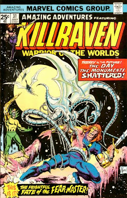
Killraven. Amazing Adventures #31

Killraven, Amazing Adventures #31, Craig Russell, Don McGregorI was an undemanding child. Generally speaking, as long as a comic didn't star Nick Fury I was happy, which means a mag had to work really hard for me to hate it.

Clearly the snappily titled Amazing Adventures featuring Killraven Warrior of the Worlds, worked incredibly hard because, when I first got my hands on it, I instantly decided it was the worst comic I'd ever read; pretentious, dull and meaningless. Not only that but it bore a noticeable resemblance to the distinctly lame Apeslayer in Marvel UK's weekly Planet of the Apes title.

A quick check made it clear that, in those tales, some crafty personage had redrawn ape heads onto mutants and robots to make Killraven look like a Planet of the Apes series. At the time, such an act seemed a con but looking back on it, I greatly admire the ingenuity concerned and wish they'd continued with the policy after they finished the Apeslayer run. I'd have loved to have seen the adventures of the Apetastic Four or Tomb of Ape-ula.

But Killraven himself was another matter. For those who don't know, the series was based on the idea that, having failed to invade the Earth last time around, in HG Wells' War of the Worlds, the Martians who'd stayed at home had developed a cure for Earth's diseases and, in the early years of the 21st century, had re-invaded, this time succeeding. Now Killraven and his motley band of Freemen were battling to liberate their world from the Martians.

Having decided Killraven was a total dud, I then changed my mind and went on to buy practically the whole run of Don McGregor and Craig Russell's series. After just two issues I was convinced it was the greatest comic ever, full of wisdom, insight and profundity, raising the American comic book to the status of genuine art form.

Amazing Adventures #31, Killraven
But Amazing Adventures #31, The Day The Monuments Shattered, was where my Killraven experience began. Reading it now as an adult, I find my opinion's swung completely back the other way. The story's just an unfocused mess. The Freemen hang around a bit, fight a monster for no noticeable reason, other than that it's there, and then kill the bad guys. What the monster's tossed into the mix for, I don't know. It just seems to be there for the sake of throwing yet another element into a story that already has two bad guys for our heroes to fight.

What never occurred to me as a kid was that the golden arches that feature so prominently in this tale are meant to be the McDonalds logo. Therefore, this tale's making a point about McDonalds, or fast food, or the consumer society, or something.

Isn't it?

The only problem is I can't figure out what that point is. And that's the trouble I have with Killraven these days which is that it seems to me that, ultimately, Don McGregor didn't actually have an awful lot to say but insisted on saying it in as many words as he possibly could.

I also wonder how Craig Russell felt about the whole thing. He was producing some of the finest art you'll ever see in a comic book, only to see McGregor plastering captions and speech balloons all over every single millimetre of it.

On top of so many words being used to say so little, there's the problem that the people in Killraven don't speak like people. They speak like poets would if poets spoke like people imagine poets speak. Even this issue's derelict sailor speaks like he majored in philosophy before becoming a booze-befuddled drunk.

And so we get the odd dichotomy, because, if anyone asked me was Killraven any good, in all honesty, I'd have to tell them no. If anyone asked me should they buy McGregor and Russell's entire run on the series, I'd have to tell them yes. Not just because it's a beautiful looking strip but because, although the thing didn't work, at least it tried to raise the American comic book to another level. And because not many comics of that time even tried to do that, it at least deserves some love for that.

Tuesday, 30 March 2010

Phantom Stranger #33. Deadman's Bluff.

Phantom Stranger #33, Jim Aparo, Mike Grell, DeadmanI always thought the Phantom Stranger was the comic book equivalent of those tin foil trays that meat pies come in. You always think you should do something with them other than just throw them away - maybe wear them as a hat or something - but in the end, you can never decide on just what.

In the same way, DC never seemed too sure what to do with the Phantom Stranger.

Here was a character who, thanks to his status as man of mystery, was nice and shiny but what exactly was his purpose?

If Marvel Comics' Dr Strange was the master of mystic dimensions, the Phantom Stranger was master of the single dimension, as he appeared to have no existence whatsoever outside the pages of his own comic and, in some issues, didn't even seem to have an awful lot of existence within them.

Phantom Stranger #32, a ghoulish raid
Thus it was that, in some tales, he was an active participant, in some a mere narrator and, in others, he'd simply appear during a lull in the action to give one of the participating characters a lecture that, while no doubt wise, was of no more practical use to them than a chocolate teapot.

Still, it didn't really matter as, despite dressing and talking like a wally, the Phantom Stranger was cool, maybe even more so than DC's other men of mystery the Shadow and the Spectre. While they might turn you into wood and chop you up or just plain shoot you, the Phantom Stranger would merely lecture you to death, which seemed an altogether more civilised, though annoying, trait.

Phantom Stranger #32, Deadman on a fridgeHere, it was Deadman's turn to get a good nagging, as, monomaniacal as ever, he was out to find the man who killed him. Given his mystical powers, the Phantom Stranger could probably have found out who killed Deadman and told him.

Instead he insists on turning up at the tale's climax to lecture the vengeful ghost on the foolishness of his ways. In one panel he lambasts the ghost because he's not going to kill a man and then three panels later, lambasts him because he is. Jeez, some people are never happy.

But you have to credit writer Arnold Drake; given the Stranger's somewhat undefined nature, it must have been no easy task to weave interesting tales around him and this tale is never dull.

Still, as with all of DC's mystery mags of this era, the main attraction's the art and, with a magnificent Jim Aparo cover and interior work by the Legion of Super-Heroes' Mike Grell, it was never going to let us down on that score. Granted the Stranger's anatomy on the front cover's a little weird - his arms seem to end just below the knee - but, that aside, it's another classic cover from the late, great Jim Aparo who at this stage of his career seemed able to churn out classic covers in his sleep.

"Follow me into strange worlds," said the blurb at the top of most issues, "-- For I am the Phantom Stranger." And I must've been hooked because I always would.

Sunday, 28 March 2010

Neal Adams, John Buscema, and Red Sonja makes three. Conan the Barbarian #44

Conan the Barbarian #44, Red Sonja, John Buscema, Neal Adams, Dick Giordano
Love at first sight. It certainly happens but does it ever last? Marvel Comics' Conan the Barbarian was an easy comic to fall in love with but also perhaps an easy one to fall out of love with. After all, like DC Comics' Weird War Tales, you don't have to read too many of those issues to realise you're getting pretty much the same few stories over and over again.

Conan the Barbarian #44, Red Sonja, dungeonBut, way back in 1975, the Hyborean Age was still a novelty to me and, unjaded by familiarity, I could fully appreciate the antics of the Hyborean battler.

In fact my first exposure to the strip had come through an unlikely source; Fleetway's unofficial Marvel Annual of 1972. Bearing in mind that the rest of the annual was made up of modern-day super-heroes like Spider-Man, the Fantastic Four and the Hulk, why they decided to include a Conan story - and from much later era than the other reprints - I've no idea but I loved it, as, pencilled by Barry Smith, Conan came up against evil sorcerer Zukala and his shape-changing daughter.

But I had to wait a full three years to finally see Robert E Howard's greatest creation in his own monthly mag; Conan the Barbarian #44.

And you know what?

It was worth that wait.

Why? Because not only was it drawn by my all-time favourite artist John Buscema, it was inked by someone called the Crusty Bunkers, which, we were told in the letters page, was a collective name for whoever happened to be hanging around Neal Adams' studio at the time.

Conan the barbarian #44, Conan gropes Red Sonja
Clearly Neal Adams happened to be hanging around the Neal Adams' studio at the time because large chunks of this tale - especially the faces - are clearly inked by him, And that combination of Adams' inks and Buscema's pencils really is something to behold. It has to be one of the most gorgeously rendered comic books of the 1970s. Not only that but Glynis Wein clearly decided to do the art justice by producing one of the best colouring jobs I've ever seen in a comic from that decade. There's just no way round it, the thing just looks fantastic.

Conan the Barbarian #44, Red Sonja captive
As it happens, it was also my first taste of Red Sonja and though it's easy as an adult to knock the scale armour bikini, things look a little different when you're eleven. She had red hair, she had a sword, she ran around in a bikini, what more could you ask of a woman?

Well, in retrospect, you could ask she be less of a wimp than she was in this tale. Although we were given the whole, "she's a warrior woman who no man can have," schtick, reading the tale now, she seems oddly ineffectual. Basically, she gets pushed around a bit, mopes around a bit and then needs to be rescued by Conan at the tale's end. Still, it was the 1970s and it was Conan's mag, not hers, so what can you expect?

At least she got to bash him over the back of the head with a rock before she left.

Conan the Barbarian #44, Conan and Red Sonja fight a giant man-ape

Saturday, 27 March 2010

Of Miracle Men and Invisible Girls. Fantastic Four #139

Fantastic Four #139, John Buscema, the Miracle ManBy the time I was eight, I'd realised a marker pen was a wonderful thing. For one thing, you could sit there smelling it - although you had to give up after a while, as you started to get dizzy - and, for the other, you could use it to join the dots on the Invisible Girl.

For those unaware of the significance of the Invisible Girl's dots, way back in the weekly Mighty World of Marvel reprints of the early 1970s, jolly Jack Kirby used to get round the problem of how to let us see an invisible character by drawing her with dotted instead of full lines. "Well," I reasoned, if being dotted meant her foes couldn't see her, then joining those dots meant she'd no longer be invisible and the enemies of the Fantastic Four could find her and kill her.

Now, this may seem a mean thing to do but, even at that tender age, I'd decided Sue Storm was a bit of a useless article. All she ever seemed to do, for issue after issue, in those tales was get kidnapped and have to be rescued.

On top of that, there was the whole Reed vs Sub-Mariner thing with her. Catch yourself on, love, you're supposed to be a good guy. Stop lusting after someone who wants to destroy the human race - especially one who's half fish - and find yourself a proper boyfriend.

Fantastic Four #139
So, you can imagine my delight when I got the Fantastic Four #139 home from Sheffield's Sheaf Market and discovered Sue Storm was no longer a member of the world's greatest super-team.

Instead, she'd been replaced by Medusa.

Now, as an adult, I can see that Medusa's power - being able to trip people up with her hair - wasn't any better than Sue's power of invisibility and, given that she was in the habit of wearing a halter-neck top, despite being a well-endowed woman with a lot of running about to do, clearly wasn't of a very practical bent either but I didn't care. When it came down to it, useless power aside, there was always something more kick-ass about her than Sue.

Fantastic Four #139, The Miracle Man
She wasn't the only one because this issue featured someone else gone kick-ass; the Miracle Man.

I knew of the Miracle Man from those reprints and knew his miracles were no more than hypnosis.

From that we were supposed to view him as a fraud - although hypnosis seemed as valid a super-power as any to me.

Still, a fraud he was declared to be and a fraud was how we were meant to see him. But here, somehow, by means never really explained, hanging around with Wyatt Wingfoot's tribe had made him all-powerful.

Needless to say, being all-powerful didn't stop him quickly getting his come-uppance again, this time at that hands of those self-same Indians who were now giant ghosts.

Fantastic Four #139, the Thing vs the Miracle ManThe other great thrill for me was the tale was drawn by John Buscema. If someone forced me to name my favourite comic book artist of all time, I'd have to go for Buscema. He might not have been an innovator like Kirby or Adams, or have put in the care and attention of a Barry Smith - and he might have had an alarming tendency to not be able to remember anything at all about any of the comics he'd drawn - but his work was just so easy on the eye that, heretical as it might be, I do enjoy actually enjoy reading his FF and Thor tales more than the Kirby ones.

Anything else about this tale stand out for me?

Not half.

The Human Torch.

His costume was red.

It might not seem important now but, for a kid, that was more than enough to seal the deal.

Wednesday, 17 March 2010

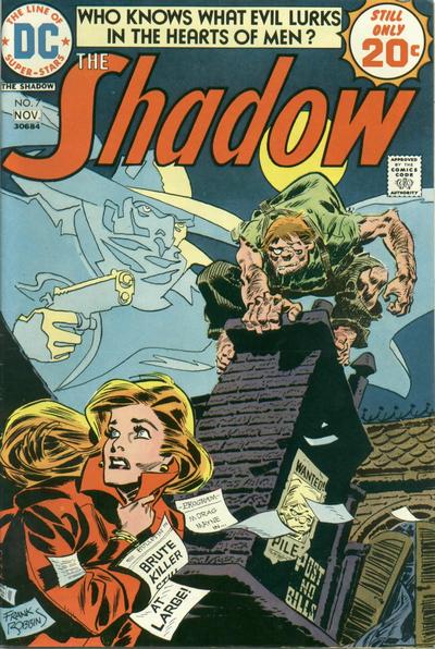
Frank Robbins' The Shadow.

The Shadow #8, Frank Robbins, Night of the MummyIf there was any DC Comics' series I wanted when I was a kid it was The Shadow.

Mostly this was because of their habit of using the mag's first couple of Mike Kaluta covers as full page ads in their other comics. "Who knows what evil lurks in the hearts of men?" asked the ads as the titular hero loomed over haunting cityscapes. Who indeed?

As it turned out, I never got my hands on any of the Mike Kaluta tales. The only ones I ever had were the Frank Robbins and the E R Cruz ones.

The E R Cruz issues I was always going to like. I'd been a fan of his work in DC's horror mags and his fluid and enigmatic style was always going to be perfect for a strip like that.

Frank Robbins on the other hand was a revelation.

Like an awful lot of people I'd always seen him as Don Heck's more demented doppelganger. His figures always looked like they were falling apart halfway through some mad, nerve-toxin induced dance of death. A natural cartoonist, I think even his biggest fan wouldn't deny his style really wasn't suited in any way shape or form to the conventional super-hero genre.

DC Comics' The Shadow #7, Frank Robbins
With The Shadow however, Robbins found the perfect vehicle for his talents.

As I've already said, I didn't have any of the Kaluta tales back then - but I have seen them since and I have to say I far prefer the Robbins version. The Kaluta tales are things of beauty all right but, like all things that strive for perfection, they're oddly uninvolving. Robbins' more frenetic and disjointed style somehow brought a life and a vigour to a character who wasn't inherently interesting.

After all, the Shadow isn't exactly the world's greatest conversationalist and the inevitability of his victories against mostly ordinary foes could drain the tension from any story. Kaluta's art, fine as it was, never overcame that problem but Robbins' greater vigour, energy and sheer strangeness went a long way to injecting animation into what at heart were inevitably lifeless tales.

Friday, 12 March 2010

Superboy #197. Timber Wolf is back from the dead

Superboy and the Legion of Super-Heroes #197, Timber Wolf returns from the dead
Much as I might like to, I really couldn't claim that when Timber Wolf returned from the dead I was delighted.

The main reason I couldn't claim it is because I'd never heard of him before he did it. Come to think of it, I don't remember him featuring at all in any of the subsequent issues I had either. So, I have to base my knowledge of Brin Londo purely on the strength of this one issue.

From that, he seems to have been some sort of precursor to Wolverine, which is appropriate given that the tale was drawn by Dave Cockrum before he jumped ship and took over on the all-new X-Men strip.

What the world of comics owes Dave Cockrum; in a surprisingly short space of time, completely reinventing the Legion of Super-Heroes and then doing the same for Marvel's not so merry band of mutants.

As a kid I always felt one thing was true; Marvel wiped the floor with DC when it came to super-heroes, and DC wiped the floor with Marvel when it came to horror and mystery comics. I still stick to that view. Granted, Tomb of Dracula was head and shoulders above any DC Horror/mystery series but that was an exception and, otherwise, the rule held true.

Superboy & the Legion of Super-Heroes #197, Timber Wolf
The inverse exception was Superboy and the Legion of Super-Heroes, the one DC super-hero mag that could hold its own in the company of the House of Ideas. With its lack of interest in the Legionnaires' private lives and its lack of a sense of ongoing continuity, it was still very much a DC-style comic but somehow it seemed less square than the typical DC antics.

Part of that, of course, would've been down to it being about teenagers but the majority of it was down to Dave Cockrum's artwork. Somehow, after years of the gang from the future looking painfully retro, he just made the Legion seem so modern.

Superboy & the Legion of Super-Heroes #197, Tyr vs Saturn GirlHere we get Timber Wolf back from the dead. It turns out he's been brainwashed by an unknown abductor to kill the Earth's president.

He's cured of that brainwashing but then it turns out he's also been brainwashed to blow up the Legion HQ.

Happily, being psychic, Saturn Girl's onto it and Timber Wolf wraps it all up by polishing off his abductor, a giant alien warlord called Tyr. Why Tyr shows up at the tale's finalé is anyone's guess. He could just have stayed on his spaceship, safe and secure and watched as the Legion HQ went Ka-Boom but that's villains for you.

But, whoever was on the cover, this was still, nominally, Superboy's comic and so we get him in solo action in a brief back-up tale. In truth, that tale's a bit of fluff really about a plot to do something or other. With its more naive, less slick and more low-key feel than the the Legion tale, it clearly belongs more to the era of Superboy that's just been disposed of rather than the new one that's in the process of being created.

Superboy & the Legion of Super-Heroes #197, Timber Wolf saves the day

Wednesday, 10 March 2010

The Son of Satan. Marvel Spotlight #12

Marvel Spotlight #12, the Son of Satan, first appearance, Herb Trimpe
As the 1970s kicked in and the Comics Code had less and less clout, Marvel moved into horror. Admittedly, for the most part it was horror grounded in the super-hero sensibility they'd developed in the 1960s but it was still a widening of the company's pallette, and one of its ventures was the Son of Satan.

Supposedly, Stan Lee'd wanted Marvel to do a comic about the Devil himself but'd been talked out of it and so, instead, we got a strip about his son.

In terms of its core concept, it wasn't exactly an exercise in originality, basically stealing the ideas behind the Omen and the Exorcist and fusing them into one but it's not what ideas you have that matters, it's how you handle them and  they clearly handled it well enough for the adventures of Daimon Hellstrom to eventually break out of the pages of Marvel Spotlight and into their very own comic.

But here's where it started; Marvel Spotlight #12.

I got this from Sheffield's Sheaf Market in the early 1970s, attracted by its melodramatic cover and use of the word Satan. I mean, come on, what ten year old's not going to want to read a comic with that in the title?

Marvel Spotlight #12, the Son of Satan
What I love about this issue are the artwork and the colouring. The pictures are by Herb Trimpe. A highly distinctive artist, you wouldn't necessarily want Herb Trimpe to draw your favourite mainstream super-hero but, when it came to off-beat characters like the Hulk or the Son of Satan, he was perfect. Here, his style's so overwrought it's a thing of twisted beauty, abetted by Marie Severin's absolutely luscious colouring job.

The story itself doesn't hold up to a lot of questioning. Daimon Hellstrom, the Son of Satan, wants to find his dad, so he can annoy him, and thus interrogates various people who might've seen him, until he has enough clues to decide Satan's probably in Hell (we're clearly not dealing with the new Sherlock Holmes here), to where he promptly goes via a conveniently located cave.

Marvel Spotlight #12, the Son of Satan
There, he has an argument with daddy, who looks a bit like the Human Torch, before rescuing Johhny (Ghost Rider) Blaze and fleeing in his fiery chariot. But, of course, it's a first appearance and the purpose of the tale isn't to tell a story, it's to introduce its protagonist and show us his powers, which it does nicely. He really is a mad and threatening thing in this tale.

Clearly the strip as it was in its début couldn't work long term because Daimon Hellstrom's shown as being as unpleasant and dangerous as his dad. You're hardly going to be rooting for him in a fight. Thus, in subsequent issues, he gained a conscience and a mission to rid the world of his father's evil, traits that're totally lacking in this outing.

In truth, his first two stories are probably his best. After those, Trimpe left the strip and, though a number of accomplished artists drew it after that, none of them were as perfect a fit as Trimpe had been. Some, like Jim Mooney and Sal Buscema, made the thing feel a little too conventional for my tastes, while Gene Colan certainly had the horror chops but wasn't best suited to depicting an exorcist who was half-super-hero.

Still, even now, nothing can take away the odd pleasure I still get from reading this issue.

Tuesday, 9 March 2010

Inhumans #2. The Kaptroids

Inhumans #2, George Perez, the KaptroidsHave you ever been grabbed the Kaptroids?

I have.

And I'm not the only one. So were the Inhumans, in issue #2 of their very own comic.

For those not in the know, the Kaptroids (or the Craptoids, as my dad called them) were giant robots built by the Kree to imprison the Inhumans who, as you know, were originally created by the Kree to fight for them in their war with the Skrulls. The robots had been left beneath the Inhumans' city of Attilan and had now been awakened by Kree agent Blastaar to fulfill their mission.

At the time it always seemed odd to me that an entire city of super-beings would be little more than Scoop 'n Go fodder for a handful of robots, and it still does.

The royal family aside, the Inhumans really are a strangely pathetic bunch here, putting up no fight worth mentioning in the face of their attackers.

Inhumans #2, George Perez, the Kaptroids, Iridia
There's also a sub-plot about an ugly Inhuman called Iridia made beautiful by the city's Terrigan mists. These days I'm not sure what to make of this sub-plot's theme. On the one hand, it seems to promote the message that looks are all that matters in life, then again, as Black Bolt knew, it's clearly cruel to force someone to be repulsive when they don't have to be.

The thing was written by Doug Moench and drawn by George Perez who, like John Byrne at his peak, had that knack of making every story feel like it was a good story regardless of whether it actually was.

In retrospect, although I loved it at the time and I still have a lot of fondness for it now, there's really nothing special about this tale and, sadly, the Inhumans' strip soon ran out of steam, as the ruling family set off into space to go all Star Trek on us.

The move didn't work. This was the Inhumans, after all, not The Guardians of the Galaxy and the title was cancelled after just a dozen issues.

Looking back on it, I think the reason I loved this tale so much was that, one, the Inhumans were cool and, two, I got it on a Sunday. For some reason, comics that entered my life on a Sunday always seemed that bit more special.

Monday, 8 March 2010

Man-Wolf. Creatures on the Loose #34.

Man-Wolf, Creatures on the Loose #34
As we all know, Marvel had not one but two werewolf "heroes" in the 1970s. Why? I'm not too sure but clearly they must've felt you can never have too much fur in this world.

Of the pair, I must confess I always preferred Man-Wolf.

Admittedly, the more commercially successful Werewolf by Night had the draw of Mike Ploog's artwork but, somehow, although I had a number of issues of that title (so it must have appealed to me), the tales have never stuck in my mind and, until that day when I repurchase them, I'm not going to actually remember what was in them.

Maybe it was because the Werewolf didn't look like a werewolf, he always looked like he had a coconut for a head. Sadly, I suspect the adventures of Coconut by Night wouldn't have been greeted with the same enthusiasm.

But Man-Wolf?

Now that was a different matter.

Originally drawn by the mighty Gil Kane for Amazing Spider-Man #124, like Gil Kane's Man-Beast in Warlock it actually looked like a wolf. It also wore the remnants of a bright yellow outfit, making it a super-hero werewolf. Not only that but, unlike the thoroughly supernatural - and therefore trad - Werewolf by Night, it was a science fiction werewolf, being astronaut John Jameson.

Creatures on the Loose #34, Man-Wolf
In truth, apart from those Spider-Man appearances, the only Man-Wolf tale I ever had was this one, Creatures on the Loose #34 but what an issue it was. Drawn beautifully by George Perez and scripted by the ever-reliable Dave Kraft, I always thought it was a cracker as the titular terror encounters a secret criminal organisation led by the bloke who runs the local petrol station.

Exactly what the secret criminal organisation actually does, I'm not that sure but they're clearly up to no good and my favourite part's always been when the one legged bad guy's about to shove our hero off a cliff while declaring he's not going to stand there outlining his plans for half an hour and give Jameson time to escape like they do in James Bond movies.

It did, at the time, seem a most refreshing attitude for a bad guy and one that most of Marvel's villains could learn a lesson and a half from.

Creatures on the Loose #34, Man-Wolf

Sunday, 7 March 2010

Adventure Comics #436. The Gasmen and... the Spectre.

Adventure Comics #436, the Spectre, Jim Aparo
I don't suppose any nostalgic trawl through the waters of the 1970s can be complete without me posting this cover; (Weird) Adventure Comics #436.

As far as I'm concerned, the 1970s were when the comic book cover reached its peak as an art from, after it had lost its previous naiveté and before it'd be reduced to the status of banal pin-up bearing no relation to the contents within. This was an era when a comic had to compete for attention with a million and one other items on the news stands and therefore had to be eye catching. And you won't get a finer example of how to get noticed than Jim Aparo's cover for The Gasmen and the Spectre. It's not just Aparo's elegant and beautifully composed pencils and inks that do the trick, it's also one of the best coloured covers I've ever seen. I don't have a clue who was responsible for that (even GCD can't help me) but they deserve some sort of medal for it.

The Spectre's short stint in Adventure Comics was an odd sort of thing, always a triumph of style over substance. After all, it had the most linear plots of all time; bad guys kill some people, the Spectre shows up and kills the bad guys. There was an attempt to add a bit more depth to it by giving Jim Corrigan a girlfriend (despite him being dead) and having a bespectacled reporter follow him around but, really, despite these attempts, the appeal of the book lay in two things. One, Jim Aparo's superb, moody art and, two, the baroque means by which the Spectre would kill his quarry.

Jim Aparo, Adventure Comics, the Spectre
My favourite method of course has to be in Adventure Comics #435 where our ghostly friend turns a crook into wood and chops him up with a buzz saw. In retrospect, I can see why this might've given some parents concerns about what their children were reading. Awww but who cares? The run was great and easily the best handling of the character ever.

I was never certain if Jim Corrigan and the Spectre were meant to be the same character. I mean, I knew Corrigan turned into the Spectre but there seemed to be no correlation between the way Corrigan thought, acted and related to the world and the way the Spectre did. For that matter was Jim Corrigan adopting the guise of the Spectre or was the Spectre adopting the guise of Jim Corrigan? It was all too philosophically complex for me.

I also always wondered how Corrigan kept his job, bearing in mind he was a homicide cop who never actually solved any cases. I actually did worry at one point about the prospect that he might get the sack. It didn't seem to occur to me that, being a ghost, Corrigan didn't actually need any sort of job. Oh the innocence of youth.

Appreciation also has to go to the back-up strip of the time, featuring Aquaman. I was never an Aquaman fan, seeing him as a watered-down imitation of Marvel's much more interesting Sub-Mariner but the thing looked so good here, thanks to Mike Grell, that, for once, I was interested.

Saturday, 6 March 2010

Avengers #9 (UK). Where it all began.

The weekend of November 17th 1973 was the weekend I started collecting comics.

Don't get me wrong, it wasn't when I started reading them - I'd been doing that for years even by that point, starting with British titles like Whizzer and Chips, The Beano, The Dandy and The Beezer, with the odd issue of TV21 thrown in, before I moved on to the likes of Marvel, DC and Alan Class - but November 17th was when I started to collect them.

In retrospect, it must've been the above comic, issue #9 of Marvel UK's Avengers mag that made me do it.

You see, up until the launch of The Avengers comic, Marvel UK's weekly reprints of their American output had been printed with matt covers. The Avengers put a stop to that. Its covers were printed on glossy paper, just like the originals, with the added plus that UK comics were much larger in size than their American counterparts. Of course, they were in black and white but that didn't matter. And the first issue of the UK Avengers that I ever owned was issue #9.

At the time, I thought it was a magical thing with its mighty Jack Kirby cover showing the Avengers smashing their way into the Mole Man's lair, its glossiness and its better page quality than Marvel's other UK mags. Admittedly, until I recently bought this comic off eBay, I couldn't actually remember anything about the Avengers' story within other than that it featured the Mole Man. The Dr Strange tale on the other hand, wherein he encountered a living house, was burned into my memory.

Having now reacquainted myself with the comic, I have to say the Avengers tale's a startlingly random thing in which ants warn Giant Man there's trouble brewing beneath the Earth's surface. The other Avengers act like jerks and refuse to listen to Giant Man's warnings and so he sets of alone to deal with things, only to be captured. Then the other Avengers feel guilty and go to rescue him but not before a bunch of subterraneans attack them for no great reason. Halfway through the tale, the Mad Ghost turns up and joins forces with the Mole Man, again for no great reason. His apes are nowhere in sight. Apparently he's decided to dispense with their services. Has he killed them? Has he put them in a zoo? Has he sold them to Michael Jackson?

We're never told.

Then the Avengers show up and whup some underground ass, priding themselves that they've set the Mole Man's plan back by several months. As the Mole Man's plan was to destroy the planet Earth, I'm not sure a few months' delay's much to be smug about but the Avengers think otherwise and seem very full of themselves.

The issue's Dr Strange tale's pure class. I must confess I generally tend to like Steve Ditko's work more in theory than in practice but there's no denying he was perfect for the adventures of the sorcerer supreme and his tale's packed with atmosphere and ominousness as the good doctor investigates a haunted house. Strange himself comes across as a bit of a tool in all honesty and I'm not sure the tale makes much sense. At the end of it all I'm still not sure what the house actually wanted and I'm not sure Stan Lee was either but the whole thing looks great and let's face it that's the main thing you ask of a Dr Strange adventure.

But wait, our American readers demand. The Mad Ghost? Who the hell's this Mad Ghost of whom you speak? I should explain that the British never had a taste for the rampant commie bashing Marvel loved so much in the early 1960s and thus, when the tales were reprinted in the UK, the Red Ghost became the Mad Ghost. Personally I prefer the change; a mad ghost is always going to sound more interesting than a red one.