Thanks to Charlie Horse 47 and Killdumpster for their sponsorship of this post, via the magic of Patreon.
***
Famous film releases were rarer than snakes' whiskers in August 1974 but there were two offerings unleashed upon the public that even I've heard of.
Those movies were Bring Me the Head of Alfredo Garcia and The Longest Yard.
Tragically for all lovers of succinct film critique, I've never seen them and don't even have any clear idea as to what they're about.
I shall, therefore, leave it to others to decide upon the worthiness or otherwise of that particular brace of movies.

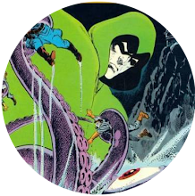
Forget Steve Austin, there's a whole new kind of cyborg in town - and he's called Deathlok!

It's true. Luther Manning makes his senses-shattering debut. One in which we discover his old army friend Major Simon Ryker is the one responsible for his current condition.
However, it seems Luther isn't alone in this. After all, it turns out that Ryker's also a cyborg!

The world's mightiest super-team gets the Giant-Size treatment when the Scarlet Witch and Quicksilver make the startling discovery that their father's none other than, Golden Age thwarter of Nazis, the Whizzer - and that they have a radioactive brother!

Shang-Chi vs the Man-Thing isn't the most obvious clash in the history of Marvel comics but a man has to begin his integration into the Marvel Universe somewhere. And why not in the swamps of Florida?

Who doesn't want a giant-sized Man-Thing?

As DC comics could tell you, you can never have too many apes on the front of a book.

No mere 20 page comic can contain the awesomeness of Conan. And that's why, this month, the battling barbarian gets his own black and white mag.

I'm sure we're all aware there's a celebrated genre of spooky romance novel covers which involve diaphanous heroines fleeing creepy old houses.

Someone at Marvel clearly likes the Man-Thing, because he's in his third comic of the month.


News like that can only bring a family together.
Provided Nuklo doesn't kill everyone with his own unique brand of radiation!
And provided the Whizzer doesn't die from a heart attack.

However, stalked by Fu Manchu's assassins, our hero has good reason to be grateful for the encounter because the beast ultimately kills the miscreants on his behalf.

We all want a giant-sized Man-Thing!
And, at last, we've got one, as the muck monster meets the Glob.
Although, judging by that cover, he's a very different Glob to the one we encountered in those old Hulk comics.
And that's not all because we're also treated to a trio of Lee/Ditko/Kirby reprints which bear such deathless titles as Ice-Monster Cometh!, I Was the Invisible Man! and Goom! The Thing from Planet X!
I'm assuming that's not the same Planet X from which Kurrgo hails.

And we've got plenty here, adorning a cover that will go on to become a free poster included with issue #1 of Marvel UK's upcoming Planet of the Apes comic.
But that's the future. What of this issue?
It launches with Doug Moench and Mike Ploog's first adventure for Jason and Alexander.
Then, we get Gary Gerani's overview of the movie series, an interview with Rod Serling, an article about the movies' use of prosthetics, and finish off with a George Tuska drawn adaptation of the original film.
Truly, it is apetastic.

And what a start it is, with our hero facing the Curse of the Undead-Man and the return of Red Sonja.
Then, Sonja's in sensational solo action, when she encounters King Ghannif who wants to make her a fully utilised cog in his harem.
Next, there's a three-page look at Conan's Women Warriors.
Then, Gil Kane's Blackmark receives 15 pages all to himself.
Next, brings the four-page Kull article An Atlantean in Aquilonia.
And we complete the issue with a reprint of Thomas and Smith's take on The Frost Giant's Daughter.

And, this month, Tomb of Dracula #23 offers its own take on that genre.
Inside, Marv Wolfman and Gene Colan serve up a treat when the king of vampires confronts a spirit which haunts Dunwick Castle, and encounters a shock ending seemingly lifted from the movie The Legend of Hell House.

Granted, this one is his own monthly book. So, it seems fair enough for him to be in it.
I do believe this is the one in which the subtly named F A Schist tries to find the Fountain of Youth and soon discovers that such a course of action was a major strategic life error.

I'm not totally sure which story's contained within this book but I think it may be the one in which Jack Russell gets his hands on a ring which allows him to retain his own mind when he transforms into the werewolf.
Needless to say, this allows him to perform heroics but - the daft sausage - he's lost the ring by the issue's end, which means he has to go back to being a mindless animal in future adventures.


34 comments:
25c in the US and 7p here. That makes £1 worth $3.57. Early to mid-70s inflation was mad though, so those 7p comics would soon be 8p and 9p while still 25c.
Steve loves his Man-Things! Fair enough!
Charlie loves his Kaluta Shadow covers and stories. #6 is awesome.
MP - like you, Buckler bridged the gap for me heading into a post-Kirby Marvel world.
And I distinctly recall being tired of Gil KANE covers by this time.
Kirby leaving the FF - Buckler steps in...
Byrne leaves the X-Men - Brent Anderson steps in...
Fill in other such titles...
Miller leaves DD; Simonson leaves Thor, etc (after my time...)
Phillip
Most of these comics pack an extra-sweet punch of nostalgia for me. Not only was I still firmly in the rosy grip of New Comics Nerd Puppy Love, but these comics were published in Late May or Early-to-Mid June (despite being cover-dated August 1974). So they went on sale in the final weeks of the school semester, or in the first few weeks of Summer Vacation. Happy Times, either way.
I have a vivid memory of reading ASTONISHING 25 while waiting for my girlfriend to finish band practice. I loved everything about that first Deathlok story. It was dark, exciting, absolutely unlike any comic I’d ever read before — Rich Buckler was at the absolute top of his game, with not a Kirby swipe to be found anywhere— and Doug Moench’s scripting took me by complete surprise, his three-part ‘split personality’ narration was eerie and effective. Seriously one of my favorite comics of the period. In an era when Marvel had quite a few excellent First Issues, this was one of the best. Sadly, none of the follow-up issues came close to matching the strange power of the first (Iron Fist had the same problem) and the series fell into a meandering, repetitive rut in a hurry. It’s unfortunate but doesn’t really matter. I still love ASTONISHING 25 to pieces.
It was the best of times, it was the worst of times….
Sigh. GIANT-SIZE AVENGERS 1 does have Buckler doing his Xerox Kirby thing and inker Dan Adkins doesn’t seem to know how to make it work. I usually like him as an inker, but the art in this one looks heavy, oily and vaguely unpleasant. Roy Thomas’ story is super-indulgent: two minor Golden Age heroes that the majority of Marvel’s current readers had probably never even heard of before are revealed to be Quicksilver and The Scarlet Witch’s parents, while their ‘brother’ a radioactive monster called Nuklo rampages, and then the High Evolutionary — aww, who the **** cares. It’s a mess. The Avengers’ regular scripter at the time, Steve Englehart never followed up on any of the events in the story, pretty much ignored it completely, and Wanda and Pietro’s origin was retconned as soon as Roy was out as Marvel’s Grand Poobah.
b.t.
Wow, Planet Of The Apes and Savage Sword Of Conan launched in the SAME month!! But that POTA cover is incredibly dull for a first-issue cover unlike the dynamic cover of Marvel UK's POTA #1 a few months later. What's happening on that POTA cover anyway? Why is that chimp in chains and why is he being arrested? The scene bears no relationship to either of the stories featured in the magazine (not that I've read the magazine, only the Marvel UK weekly).
Boyoboy, Steve, the joys of 1974 just keep on coming! I'm with b.t., there is a hefty hit of nostalgia among these offerings (all that's missing is some vintage 74 music in the background- Time/Life cds, thinking of you...).
Bought most of these, but especially loved PoTA and SSoC (and who doesn't enjoy acronyms?). Savage Sword was a particularly nice visual treat- that Red Sonja story by Esteban Maroto and Neal Adams is gorgeous. Wish I still had the Ape book, even more so now that Steve informed us that Ploog did a story within.
And speaking of Mike Ploog, count me among those grateful for the opportunity to acquire a Giant Size Man-Thing. Mr. Ploog rendered it so well...
Oh, and b.t.- that Deathlok tale was a winner. Nice art and a unique story.
Colin, I agree about that PLANET OF THE APES cover — the composition is very static, the color scheme is kinda ugly, the whole Ape Vs. Ape thing is weird etc. But I’m not gonna lie, it was the first b/w Marvel Mag I ever bought, so that cover triggers a certain amount of fondness for me.
I generally liked that initial installment of ‘Terror on the Planet of the Apes’ despite some script deficiencies (the supposedly wise Lawgiver leaves the wishy-washy incompetent Whats-his-name in charge when he knows racial tensions are brewing; Jason the series’ lead human character is an obnoxious, insufferable prick etc) but the Mike Ploog artwork is excellent.
I thought for sure I bought a copy of GIANT-SIZE MAN-THING 1 closer to the end of the school semester but the GCD says it went on sale May 7th. Whatever! Not much to say about this one. Steve Gerber’s story is nothing special, mostly just an excuse to get Man-Thing in a sloppy punch-up with The Glob, another mindless Muck Monster. More fun Ploog art on the cover and the lead story.
TOMB OF DRACULA 23 actually continues a storyline begun a few months earlier in GIANT-SIZE CHILLER 1. In that one,, Drac met Sheila Whittier, a lovely young woman who happened to still be living in the great big mansion that Drac had decided to take possession of. Unfortunately, some mysterious demonic force or poltergeist or something had been physically attacking her and in TOD 23 we find out who and what it is. Dracula makes short work of him/it. Sheila is grateful, kinda/sorta falls in love with him and becomes his willing human servant for the next couple of months. The Kane/Palmer cover is all right, but I’ve always thought the coloring kinda wrecks it. That bright baby blue sky — I mean, really.
MAN-THING 8 — still more groovy Ploog art! Concluding chapter of a two-part horror adventure. That gnarly zombie-looking dude on the cover (F.A. Schist after he drank from the Fountain of Youth, right?) is pretty strong stuff for the cover a Code-approved Bronze Age comic.
After Ploog vacated WEREWOLF BY NIGHT, I gave Don Perlin a chance for an issue or two, but I’d stopped buying it by the time issue 20 came along. Come to think of it, WBN might have been the first comic that I made a conscious decision to ditch. Certainly wouldn’t be the last. Guess that Nerd Puppy Love Effect might have been starting to wear off.
FWIW, the song I most associate with these comics is Joni Mitchell’s ‘Help Me’, which peaked at #7 early in June.
b.t.
Colin
I reckon that cover is set immediately after climax of the first movie, with Cornelius (the chimp) being arrested. Presumably that’s supposed to be Zaius and Zira amongst the gorilla soldiers. I agree the UK cover to POTA weekly #1 (which is POTA monthly #2) is superior and actually matches the content of both our weekly this monthly.
Years later I had the Australian edition of this, which used the US monthly (#1) cover and featured both the movie adaptation and Jason & Alexander story, but omitted some of the background features. It was saddle stitched (stapled) rather than square bound, and was probably had 8 fewer pages (from memory, as I disposed of it years ago). Obviously the UK weekly ran the first movie adaptation and then the first Jason & Alexander story, fully realizing they’d soon run out of original story pages under a weekly schedule. Leading to the legend that is Apeslayer!
DW
Deathlok's a great comic, without a doubt. Like Steve Rogers, Luther Manning's a super-soldier. But, whereas Captain America's the American Dream, Deathlok's the American Nightmare. A post-Watergate/Nixon comic, in every sense, Deathlok rips the Stars & Stripes off his costume, and grinds it under his foot! ( in Astonishing Tales # 28). Like Man-Wolf, Deathlok combines Sci-fi & horror. Manning finds a book, under rubble, and - dusting it off - realizes it's Frankenstein - what Deathlok himself is, in essence! (Ibid!) Does another issue reference Frankenstein, the movie, with Deathlok's reflection in a puddle? (the Incredible Hulk tv series, likewise?) There's Deathlok as a Christ-figure, (lots in American literature!) with a crucifixion-type scene - you name it, the comic's got it all! Marvel stories often counterpoint hot-heads & rational types (the Thing & Reed, Hawkeye & the Vision, etc). Deathlok had this counterpoint too (but internally), as Luther dialogues with " 'puter", all the time! To repeat, you name it, the comic had it! Steve's spot on about Deathlok referencing the Six Million Dollar Man all the time, too! In one issue, Deathlok's bionic eye enables him to track 'invisible' footprints, by looking into the infra-red. Steve Austin did this, in the Bionic Man episode, in which Austin tracked some aliens (not Bigfoot - a different episode!) The issue referencing Deathlok's weight as 600lbs (on a fire-escape) - well, Steve Austin said that, judging by Oscar Goldman's deep depressions in the carpet-pile, Oscar must weight 600lbs (one of the 2 - or 3? - robot Oscar episodes!) Deathlok's helicopter landing on a skyscraper (Astonishing Tales # 26), to clobber his supposed creators, is reminiscent of Doug Moench's Moon Knight origin, where Marc Spector's (Frenchie's?) helicopter lands on a skyscraper, where 'The Committee' (?) resides. You also got a lot of relentless pursuits - e.g. Cannibals - like with Misty & Coll with Vampies - but, I digress...In the UK, 'Star Wars Weekly' was Deathlok's native habitat, and I thoroughly enjoyed it, at the time. Obviously, some issues outperform others. War-wolf (the sci-fi/horror theme, again) seemed a fantastic opponent (like Photon, in Spidey, having the strength of 20 men!). Yet, decades later, getting the conclusion, Deathlok defeated War-wolf (his best mate & mucker, Mike) far too quickly & easily. Anyway, I've gone on too long. Needless to say, Deathlok was good!
Phillip
DW, there was a brief story called 'Evolution's Nightmare' in POTA #20-22 before the dreaded Apeslayer era began in #23.
bt, that TOD cover was also used as one of the early covers on Marvel UK's Dracula Lives weekly (#10 I think) which was launched on the very same day as the UK POTA weekly.
On a completely different subject - I was in Tesco this morning and they played REM's Losing My Religion followed by Madonna's La Isla Bonita and The Blow Monkeys' Digging Your Scene so three pop classics heard during a single trip to Tesco!
Steve - you, Nigel Farage and Tim Walz (Kamala Harris's running-mate) were all born in the same week!
Hey Steve, since we went right from ‘Fifty Years Ago’ to the Lucky Bag, does that mean it’s Last Call for ‘August 1974’ comics? Okay if I mention some other comics from that month before we move on?
b.t.
b.t., I can't speak for Steve (obviously) but I am definitely up for an analysis of Eerie #59, and the saga of Dax the Damned.
-sean
Bt, you are 100% free to mention as many of those comics as you want to.
Colin, it's a thrill to me to discover I was born amidst such salubrious company.
PS. I must report that I'm seeing the strange version of the comments form that others have reported. I have no idea why it's looking like that.
In other news, I can report that, of this month's crop of US comics, I owned:
Three Marvels:
Strange Tales #175
Tomb of Dracula #23
Werewolf by Night #20
and Five DCs:
The Witching Hour #45
Weird War Tales #28
Action Comics #438
Adventure Comics #434
Superboy #203
An improved version (clearer, sharper colours) of Giant-Sized Avengers # 1 was used in Marvel UK's 1978 Annuals' inside covers:
https://www.amazon.co.uk/Incredible-Hulk-Annual-1978/dp/0723504571
Phillip
Obviously, I meant an improved version of Giant-Sized Avengers # 1's cover!
Phillip
Testing…testing…
b.t.
Well, dagnabbit - I had a whole detailed analysis of EERIE 59 typed up for sean on my iPad , hit “PUBLISH” and got a pop-up saying “an error occurred” — then it disappeared — must be something screwy with my iPad. Oh well, at least my phone is still ok.
In short, sean, EERIE 59 was swell 😊
b.t.
COLIN- I too am now having these 80’s mini-marathons at the grocery!!! It’s like “Charlie’s here! Ramp up the new wave synth new wave!”
KULL 15 — MORE Ploog Art! When did that guy ever sleep? Too bad he’s practically unrecognizable beneath Chan’s inks in this one.
Two great DC 100-pagers — no nostalgia involved, I didn’t get these until years later:
DETECTIVE 442– Goodwin/Simonson Manhunter chapter, Simon & Kirby Newsboy Legion reprint, EXCELLENT Goodwin/Toth Batman lead story — the splash page is freaking brilliant
TARZAN 232 — 2nd chapter of Kubert’s adaptation of TARZAN AND THE LION MAN — not one of ERB’s best but the dynamic art is tasty ; beautiful Alex Nino Korak backup; Fun Russ Manning newspaper strips re-formatted by Kubert into standard comics pages, with uneven results. Manning was apparently FURIOUS about these.
RIMA THE JUNGLE GIRL 3 — Kubert layouts / Redondo finished art up front, trippy Nino Space Voyagers in back . What a great little run this was!
RED CIRCLE SORCERY 8 — highlights include “The Man Who Tried To Kill Death” with art by Alex Toth, featuring a swashbuckling pirate who looks like Errol Flynn and challenges Death to a duel and (no surprise) loses — and “Die in the Name of the Law” with art by Gray Morrow featuring a photo-referenced Alex Toth as a retired Pulp author whose Shadow-like character The Cobra possess a young Pulp fan and kills crooks for real. Both stories are pretty dumb TBH but the art is nice.
b.t.
Charlie, I always hope to hear at least ONE familiar song when I'm in Tesco and I often don't recognise ANY of them so hearing THREE classic songs back-to-back was a rare treat!
bt, I've just checked and the cover of Tomb Of Dracula #23 was indeed used as the cover of Marvel UK's Dracula Lives #10 in December '74 but the UK version changed the blue sky to grey with black streaks and also added word balloons so the UK cover is a big improvement I'd say.
The UK Dracula cover also removed the two dramatic blurbs on the TOD cover.
EERIE 59–
Esteban Maroto originally wrote and drew the Dax stories for the Spanish Comics Market. When they were first printed in EERIE, the English language versions were scripted by McGregor, Wolfman, Englehart and Skeates; for the 100-page reprint special , they were re-written by Budd Lewis in a more flowery, high-falutin’ style that better matched Maroto’s baroque graphics.
Dax himself is a lean, muscular wandering barbarian swordsman who gets involved in a variety of fairly stock sword and sorcery scenarios, encountering demons, witches, mythological creatures, evil sorcerers and many beautiful half-naked (often topless) women, most of whom he ends up making love to.
It sounds pretty by-the-numbers but Maroto’s lush artwork brings it all vividly to life. Dax’s world is more stylized and dream-like than Conan’s earthy, relatively “realistic” Hyborian Age. Maroto’s page layouts are imaginative, his settings are strange and exotic, his horrors are genuinely grotesque and creepy, and the women, Dear God, the women are off-the-charts gorgeous. As a 13-year-old, I thought it was just about the most amazing comic I’d ever seen.
b.t.
I think we can all agree, '74 was a great year for Marvel!
And the cover featuring Man -Thing's battle with the Glob has tempted me to once again list all the swamp-monsters in comics.
...But I'm not going to do that,. I will spare you all.
Suffice to say, swamp-type monsters were a big deal in the '70's. We had a major Bigfoot problem.
Google The Legend of Boggy Creek! Yikes!
As a kid, I moved my bed as far away from the window I could, to avoid a hairy claw smashing through in the night.
M.P.
Disappointing that M.P. decided not to list old comic-book swamp monsters. But a least we did get a take on Esteban Maroto's Dax the Damned!
b.t., I'd definitely have been impressed by Eerie #59 if I'd read it at 13. Actually, I think it was around that age (a little later) that I did discover the Warren mags... and I was even into 1984/94.
Astonishing Tales #25 is a comic that you probably had to read at the right age at the right time to get the most out of too. I thought the Deathlok series was a bit like Killraven, a concept that no-one really had much idea of what to with, that didn't start to get any good tíl later in the run. With Deathlok, that was when Bill Mantlo came on as scripter, and yes - I do know how strange that s #33 was a fantastic comic - especially as Klaus Janson was on inks by then too - but that's where I came to the series back in the day, so maybe that explains it?
I mean, I still really like Giant-Size Man-Thing #1, but if I'm honest the bizarre mash up of 70s themes - entropy, self-actualization (whatever that was), a villain that looks like Richard Nixon, and geodesic domes - might well not do it for me if I was reading it for the first time now.
But I did read it in 1974 and it was great.
-sean
GIANT-SIZE FANTASTIC FOUR 2 — not one of my favorite John Buscema comics, I think it must be partially because I didn’t think Chic Stone was a very good inker for him. Also, maybe it was a bit of a let-down after my excitement and enthusiasm over GIANT-SIZE SUPER-STARS 1 (I’m still gushing over that one 50 years later). Also, as Redartz has pointed out, sometimes the printing of Marvel’s Giant-Size books had tendency to look a bit muddier than the regular-sized books — I seem to recall this one looking particularly drab and lifeless.
b.t.
*and yes - I do know how strange that sounds
#@*%! This new comment format is a bit of a pain in the arse to use, Steve. You have keep scrolling all the way through just to go back and correct anything.
I had intended to offer my take on SSOC #1 too. Unfortunately you will just have to miss out on my critical analysis of Gil Kane's Blackmark, and post-feminist deconstruction of Red Sonja.
-sean
Pedants corner -
Charlie, b.t., The Shadow #6, Detective #442, Tarzan #232, and Rima #3 are all cover dated September.
-sean
Sean, it is indeed annoying. Sadly, there doesn't seem to be any way of changing it.
EERIE 59 - Part 2–
Part of the reason why EERIE 59 had such a big impact on 13-year-old Me was how relatively classy and up-scale the entire package looked (yes, I know I’m talking about a sword and sorcery comic full of monsters and nekkid ladies — I DID say “relatively”)
I’d been excited about finding a copy of POTA 1 out in the wild, but spotting that dark and stylish Ken Kelly cover on the magazine rack at the grocery store was like an totally unexpected bomb going off. On closer inspection, I almost couldn’t believe what I was looking at.
Page after page of gorgeous Maroto art filled with barbaric, erotic splendor, one of the stories presented as an vivid 8-page full color insert, a magnificent full color Sanjulian painting on the back cover — even the ADS were a thousand times cooler than the tacky ads for mail-order Kung Fu tutorials and bodybuilder regimens in POTA 1. Marvel’s b/w product looked kinda cheap in comparison.
It was a jolt to discover there was another comics company out there publishing high-quality b/w comics mags, and apparently had been for quite awhile, one that I’D NEVER EVEN HEARD OF BEFORE — it was like Dorothy stepping out of her drab b/w farm-house into blazing Technicolor Oz (well, not exactly like that, but the sudden paradigm shift did seem that surreal and intense in the moment).
b.t.
Steve, I think your spam filter may have just gobbled up one of my posts. Or I may have screwed up something on my end. It’s been that kind of a week.
b.t.
Bt, it was indeed languishing in the spam filter. I've now restored it and it should be visible to everyone.
Post a Comment