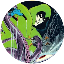
As the 1970s kicked in and the Comics Code had less and less clout, Marvel moved into horror. Admittedly, for the most part it was horror grounded in the super-hero sensibility they'd developed in the 1960s but it was still a widening of the company's pallette, and one of its ventures was the Son of Satan.
Supposedly, Stan Lee'd wanted Marvel to do a comic about the Devil himself but'd been talked out of it and so, instead, we got a strip about his son.
In terms of its core concept, it wasn't exactly an exercise in originality, basically stealing the ideas behind the Omen and the Exorcist and fusing them into one but it's not what ideas you have that matters, it's how you handle them and they clearly handled it well enough for the adventures of Daimon Hellstrom to eventually break out of the pages of Marvel Spotlight and into their very own comic.
But here's where it started; Marvel Spotlight #12.
I got this from Sheffield's Sheaf Market in the early 1970s, attracted by its melodramatic cover and use of the word Satan. I mean, come on, what ten year old's not going to want to read a comic with that in the title?
What I love about this issue are the artwork and the colouring. The pictures are by Herb Trimpe. A highly distinctive artist, you wouldn't necessarily want Herb Trimpe to draw your favourite mainstream super-hero but, when it came to off-beat characters like the Hulk or the Son of Satan, he was perfect. Here, his style's so overwrought it's a thing of twisted beauty, abetted by Marie Severin's absolutely luscious colouring job.
The story itself doesn't hold up to a lot of questioning. Daimon Hellstrom, the Son of Satan, wants to find his dad, so he can annoy him, and thus interrogates various people who might've seen him, until he has enough clues to decide Satan's probably in Hell (we're clearly not dealing with the new Sherlock Holmes here), to where he promptly goes via a conveniently located cave.
There, he has an argument with daddy, who looks a bit like the Human Torch, before rescuing Johhny (Ghost Rider) Blaze and fleeing in his fiery chariot. But, of course, it's a first appearance and the purpose of the tale isn't to tell a story, it's to introduce its protagonist and show us his powers, which it does nicely. He really is a mad and threatening thing in this tale.
Clearly the strip as it was in its début couldn't work long term because Daimon Hellstrom's shown as being as unpleasant and dangerous as his dad. You're hardly going to be rooting for him in a fight. Thus, in subsequent issues, he gained a conscience and a mission to rid the world of his father's evil, traits that're totally lacking in this outing.
In truth, his first two stories are probably his best. After those, Trimpe left the strip and, though a number of accomplished artists drew it after that, none of them were as perfect a fit as Trimpe had been. Some, like Jim Mooney and Sal Buscema, made the thing feel a little too conventional for my tastes, while Gene Colan certainly had the horror chops but wasn't best suited to depicting an exorcist who was half-super-hero.
Still, even now, nothing can take away the odd pleasure I still get from reading this issue.
Wednesday, 10 March 2010
Subscribe to:
Post Comments (Atom)


2 comments:
What, no comment under one of your reviews, Steve? Lets see if we can't do something about that...
Good to see your opinions were spot on even in the early days of the blog. Creatively speaking, this comic was definitely more than the sum of its parts, considering what a terrible writer Gary Friedrich was, that Herb Trimpe wasn't exactly Marvel's greatest artist, and Frank Chiaramonte seemed to be a fairly pisspoor inker.
As you imply, for maximum effect you really had to be the right age at that particular time to enjoy Son of Satan - the issue I actually got as a little scrote back then was the next one, Marvel Spotlight #13, so inevitably I think its a better one. But even coming to #12 as a back issue a few years later it was still quite enjoyable.
I seem to recall reading somewhere that at the outset Son of Satan (and presumably Ghost Rider) had been intended for one of the black & white magazines. Which seems plausible as Marvel were putting out a whole rash of horror mags in the second half of '73, and the first two Spotlight SoS stories do have that thrown together, misanthropic feel.
I guess Daimon Hellstrom could have survived as an unpleasant character in an anthology title free from the comics code - like, say, Dauntless Don McGregor's Morbius in Vampire Tales - but it was inevitable he'd have to change to fit a colour comic series. As I recall that happened fairly abruptly with #14, under new writer Steve Gerber.
His first couple of stories were quite good in their way, but he seemed to lose interest fairly quickly...
-sean
Thanks, Sean.
That's interesting, about him having originally been intended for a black and white book. I wonder if the decision to use colour was made after the first story was drawn? It might explain why Trimpe's art is noticeably more detailed and, "worked on", than normal.
Post a Comment