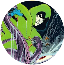
And he was absolutely right. After all, just how many Atlas comics did I buy in the mid 1970s purely on the strength of their covers, only for the insides to turn out to be a cannibalism-fixated car crash that even that man could never have imagined?
Still, I can't feel even one moment of buyer's remorse over that repeated blunder, as just possessing those covers made the purchase feel somehow justified.
And a massive part of that was down to one man.
Dick Giordano.
Not only was he arguably Neal Adams' best inker, he was, even more impressively, Atlas Comics' main weapon in the battle to separate you from your 25 cents. Who could ever forget his covers for the debut issues of The Brute, Phoenix and Targitt?
I can't. And neither can you because I'm posting them right here and now. Truly, those covers are things of beauty. No wonder Giordano was my favourite Atlas Comics cover man.


"But what's this all about?" I hear you ask. "Has so much time passed that it's now possible to wax lyrical over even the product of Atlas Comics?"
Of course it hasn't. That much time will never exist in this universe. However, I can at least acknowledge that their covers were great.
This has struck me because perusing Nick Cardy's magnificent image for Superman's clash with Captain Thunder, the other day, has reminded me just how important a cover was in selling a comic to the youthful me and that most of the DC comics I acquired back then were bought purely because of Cardy's handiwork.
However, there was one artist whose covers could sell DC's product to me even more surely than his could.
And that was Jim Aparo. I genuinely don't think I ever saw a Jim Aparo cover without taking it home with me. I am very happy, therefore, to nominate Jaunty Jim as my Number One DC cover artist.


When it came to Marvel, covers never seemed as important to me as they did for DC. That may be because the contents of Marvel comics were more appealing to me and, therefore, the front of them didn't need to impress me as much.
However, I would say the artist whose covers best succeeded in getting me to buy Marvel comics was Gil Kane. I, therefore, have no hesitation in naming Galloping Gil as my favourite Marvel cover artist.


So, that's Marvel, DC and Atlas Comics accounted for but what of the fourth leg of the table which was my childhood comic collecting hobby?
That leg was Charlton Comics. That small company, based in a town I've never heard of, lacked the funds, glamour, profile and even the straight-edged guillotine of the other companies but a horror-lover like me was always going to be drawn to them.
And a major part of that was down to the work of Tom Sutton, a man I always feel was criminally underrated. He may not have been everyone's cup of tea when it came to super-heroes but the man was born to draw horror and his work on their covers never failed to convince me I needed yet more Charlton comics in my life. He, therefore, gets my vote as favourite Charlton cover artist.


So, those are my favourite cover artists. No doubt, you have ones of your own. If you do, you're free to share them in the comments section below.


 Posts
Posts