And he was absolutely right. After all, just how many Atlas comics did I buy in the mid 1970s purely on the strength of their covers, only for the insides to turn out to be a cannibalism-fixated car crash that even that man could never have imagined?
Still, I can't feel even one moment of buyer's remorse over that repeated blunder, as just possessing those covers made the purchase feel somehow justified.
And a massive part of that was down to one man.
Dick Giordano.
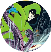
Not only was he arguably Neal Adams' best inker, he was, even more impressively, Atlas Comics' main weapon in the battle to separate you from your 25 cents. Who could ever forget his covers for the debut issues of The Brute, Phoenix and Targitt?
I can't. And neither can you because I'm posting them right here and now. Truly, those covers are things of beauty. No wonder Giordano was my favourite Atlas Comics cover man.


"But what's this all about?" I hear you ask. "Has so much time passed that it's now possible to wax lyrical over even the product of Atlas Comics?"
Of course it hasn't. That much time will never exist in this universe. However, I can at least acknowledge that their covers were great.
This has struck me because perusing Nick Cardy's magnificent image for Superman's clash with Captain Thunder, the other day, has reminded me just how important a cover was in selling a comic to the youthful me and that most of the DC comics I acquired back then were bought purely because of Cardy's handiwork.
However, there was one artist whose covers could sell DC's product to me even more surely than his could.
And that was Jim Aparo. I genuinely don't think I ever saw a Jim Aparo cover without taking it home with me. I am very happy, therefore, to nominate Jaunty Jim as my Number One DC cover artist.


When it came to Marvel, covers never seemed as important to me as they did for DC. That may be because the contents of Marvel comics were more appealing to me and, therefore, the front of them didn't need to impress me as much.
However, I would say the artist whose covers best succeeded in getting me to buy Marvel comics was Gil Kane. I, therefore, have no hesitation in naming Galloping Gil as my favourite Marvel cover artist.


So, that's Marvel, DC and Atlas Comics accounted for but what of the fourth leg of the table which was my childhood comic collecting hobby?
That leg was Charlton Comics. That small company, based in a town I've never heard of, lacked the funds, glamour, profile and even the straight-edged guillotine of the other companies but a horror-lover like me was always going to be drawn to them.
And a major part of that was down to the work of Tom Sutton, a man I always feel was criminally underrated. He may not have been everyone's cup of tea when it came to super-heroes but the man was born to draw horror and his work on their covers never failed to convince me I needed yet more Charlton comics in my life. He, therefore, gets my vote as favourite Charlton cover artist.


So, those are my favourite cover artists. No doubt, you have ones of your own. If you do, you're free to share them in the comments section below.


47 comments:
There's virtually no debate from me regarding your monologue on this topic, Steve.
Covers were VERY important to me when I was a child. With having a short time to decide on which book(s) to purchase, a good cover helped.
My mother would either yell at me to hurry up behind me as I shopped, or sit in the car tapping her foot then scream at me for taking too long.
I didn't have the luxury of leafing through comics before purchasing in my youth.
Kane & Kirby sold alot of Marvel to me.
In no particular order:DC is Adams..... by a country mile!!! Marvel is Kirby(with a special fondness for covers probably uncared for by my fellow contributors:FF 95 and Thor 171/172).Atlas would be Ditko Wood combination or the strange mix of Ditko/Wrightson, though this may be interiors only as opposed to a cover!Finally the poor relation that is Charlton which would again be Ditko but with a nod to your choice Steve. Interesting point that someone may confirm:Covers paid more to the artist and I believe Gil Kane had alimony problems in the early 70's hence the absolute glut of Kane covers from 1972-1977,which of course was no bad thing and lent a certain uniformity to Marvel comics of the time.
When it comes to the period covered by your blog Steve, my fave covers were by Steranko.
He was by no means the best artist in comics at the time, but he certainly knew how to stand out from the rest. C'mon - SHIELD #s 4, 6 and 7, that King-Size Hulk... you know the ones.
DC generally had more accomplished artists, in the illustrative sense.
Cardy is a good example - its hard to imagine him working for Marvel - as are Berni Wrightson, Mike Kaluta, Joe Kubert and of course, as FF follower says, Neal Adams. I bought comics mainly for the cover by all of them at some point, which I rarely did with anything from Marvel.
Wrightson tops the list for me.
Kirby is in a category of his own really - I loved his stories, so the covers always appealed (except the bait & switch ones on other Marvel books from the later 70s - they were a mixed bag).
Look at Kamandi #23 - "Die bungling gnat!" How could you resist it?
Best Atlas cover artist was - somewhat astonishingly - Neal Adams. On Iron Jaw. Talk about not being able to judge a book from the cover!
Don't really have much of an opinion on Charlton, so I'll go along with you on Tom Sutton.
-sean
Actually, thinking about it, by the start of the '80s you start to get really striking covers by the mighty Bill Sienkiewicz... Loved his werewolf on the front of Moon Knight #29 -
www.comics.org/issue/37235/cover/4/
-sean
I didn't appreciate those Charlton comics as much as I should have when I was a kid.
With me it was all super-heroes and outer space, or better yet, super-heroes in outer space.
The cosmic stuff, that's what really got me going.
But looking back, Charlton's horror stuff was enthralling to a young M.P. as well.
Our local comic/toys and weird stuff store here is better than it oughta be, given the locale (I suspect somebody's got a trust fund), and sometimes they sell battered old Charlton's for a quarter a pop. Ghost Manor, Dr. Graves, stuff like that.
Man, you can't lose on that deal. I've enjoyed looking at that creepy stuff again. And then there's those crazy ads from the '70's. My favorite is the ones for T-shirt iron-ons. They were one of the cool and goofy things about the '70's. Every kid needed a few cool T-shirts, especially during those bright, endless summers.
M.P.
(Well this like asking which is your fav Beatles song, lol.)
Atlas - would have to be Scorpion 1 (and 2?) as drawn by Howard Chaykin.
DC - the $.15's would have to be Adams, the $.20s would be Aparo's Batman and Spectre. Were it not for the small body of work I would likely pick Kaluta for his Shadow covers. (Honorable mention has to go to Kirby's Dingbat covers!)
Marvel - $.12 - $.15 probably has to go to Steranko though it is a small body of work. $.15 - $.20 is a toss up between Buscema (FF 120) or Colan (all those DDs and Caps).
Charlton- Sorry Steve but Charlie is going to go with Joe Staton and E-Man! He's a nice chap too! He was more than gracious with us at C2E2 this spring in Chicago!
All that said I suspect that Steranko has the most iconic covers considering his small body of work?
I always thought Nick Cardy was a fantastic cover artist. He was the go-to guy at D.C. in the '60's and '70's, and did a few of the amazing covers on those giant treasury additions they put out that are suitable for framing. Which I did, in my old place! Mike Grell did a fantastic job there too. Remember that Justice League of America treasury edition, where they're all running or flying right at you?
Same deal with John Romita Sr. Stan the Man was wise to make him the art director. He could take another artist's rendition for a cover and give it a really clean, classic look. And nobody did a slicker Spider-Man than he did.
M.P.
I meant "editions" rather than "additions".
How mortifying. Senility is already taking root. I'm apparently slowly unlearning the English language, which is dire news, because my Spanish sucks.
M.P.
I can only comment on Marvel. And I was going to say John Romita Snr until Charlie reminded me of Steranko. It's got to be Steranko all day long,
Gil Kane on almost everything for Marvel in the seventies. Frank Brunner on Doctor Strange. Jim Starlin on Captain Marvel and Warlock. Neal Adams on DC superheroes and Joe Kubert for DC war and Tarzan.
Seems a shame to not mention those very early Mighty World of Marvel covers by Jim Starlin which surely played a part in getting the whole Marvel UK bandwagon going (and thereby enlivening many of our childhoods this side of the pond).
I was always a major sucker for anything fronted by Chaykin or Ploog too.
Can't argue with Kirby or Kane though ... and so many beauties to choose from from both of their prodigiously high number of covers.
Lots of good choices here, both in your OP and in the comments. I don't really have anyone to add that hasn't already been mentioned so i'll just critique your picks:
Dick Giordano. Bravo to you. The man doesn't get nearly as much attention as he should, and not just as "Neal Adams' best inker".
Jim Aparo. Super-solid artist, a bit "Adams-like" (or maybe "Adams Lite") but in his peak years he was really really good. i was a total Marvel Zombie as a kid, and BRAVE AND THE BOLD was just about the only DC book i bought every single month, just for his art.
Gil Kane. Yup. He and Romita Sr. were the main Marvel Cover Guys of my formative years. Both so ubiquitous that a cover by Starlin or Ploog or Brunner or whoever would stand out as a "special treat" but Kane and Romita consistently did excellent covers, month after month.
Tom Sutton! EFF yeah.
- b.t.
Agree with b.t. that Giordano should be remembered for more than his inking. While personally I found his own artwork to be very competent but a little stiff (sorry), his major contribution to American comics was surely as an editor.
Dark Knight, Watchmen and Sandman all came out when he was e-i-c (I think earlier at Charlton he gave Aparo his first comic book work).
Which reminds me that in the 70s a lot of the editors at DC were artists, like Joe Orlando and Joe Kubert - Carmine Infantino even made publisher - which was quite different to Marvel, where they'd all been writers.
I suspect that may go some way to explaining the differences between both companies, like their respective approach to covers...
-sean
Ploog's Ghost Rider, Man-Thing & Werewolf By Night covers were excellent.
Sean, I still have that King-Size Hulk #1. I'm always torn between selling it or framing it.
Wish I still had that Steranko Cap vs. Hulk book. Steranko made the Hulk almost seem demonic. Such a different take from any other artist.
Thanks to all of you for your comments so far. Jim Steranko, Mike Kaluta, Jim Starlin, Frank Brunner, Neal Adams, Joe Kubert, Bill Sienkiewicz and Bernie Wrightson definitely stand out for me amongst the ones mentioned.
What you said, Steve. We were very lucky, as comics fans, to have had such a swarm of great artists putting out books for us.
In my opinion, though, it was disheartening when the interior art was below par compared to the cover.
Invaders. Nuff said.
MP-
That shop you mentioned sounds cool. Where is it? Sounds like a road trip to me.
Charlton comics had totally different ads than DC & Marvel. I remember seeing a full-pager advertising the Mothers Of Invention's Freak Out album!
If I recall correctly, I ordered the Farrah Fawcett fan club kit from Ghostly Haunts. Lol!
Speaking of ads --
In the first few months of the Atlas comics, there was a full-page ad for Steranko's COMIXSCENE magazine that blew my 13-year-old mind to shreds. You guys know what i'm talking about, right? The main image was one of his crazy sword and sorcery covers complete with supine near-naked lady, reproduced (quite nicely too) in half-tone with a color overlay. Little cameo boxes with images of Dr. Zaius, Maroto's Red Sonja etc. I was all "MUST. HAVE. THAT." I looked and looked and looked all over town for it, but no dice. How was i to know there were magazines that WEREN'T distributed the usual way, at newsstands and convenience stores, etc?
Didn't they also try to do their own version of Warren's Captain Company? Where they sold things like POTA models through the mail?
- b.t.
Atlas, that is, with the mail-order thing. Though Steranko did it too in COMIX/MEDAISCENE/PREVUE.
- b.t.
b.t.-
I remember that add. It didn't take much to send my adolescent blood a-boiling, lol!
This is from a guy, who as a child, thought he might see something if he stared at the Tijuana Brass' Whipped Cream & Other Delights album cover long enough. I was a horn-toad. Lol.
Charlton advertised Freak Out, and you got a Farrah Fawcett fan club kit eh? I am impressed by your priorities Kd.
The problem with that King-size Hulk cover of course is the "corrected" face, redrawn by Marie Severin. Funnily enough, when it was reprinted by Marvel UK they used the original Steranko version (well, with changes to the Inhumans lettering), as detailed by well known authority Steve Who Does Comics -
https://stevedoescomics.blogspot.com/2015/03/march-22nd-1975-marvel-uk-40-years-ago.html
(Hey - the same week they changed the Vision to Thor on the cover of Avengers Weekly!)
-sean
That reminds me of a very funny story.
I bought a small collection, and was selling it off at a flea market.
A guy pulled out a silver-age Avenger, and while he looked at an Overstreet to make me an offer, I checked the grade.
I don't know the issue, but Jan Van Dyke was kidnapped (Ultron?) out of a pool while wearing a bikini.
The kid that owned the book ERASED HER BIKINI IN EVERY PANEL, AND DREW IN NIPPLES & PUBIC HAIR!!!
I said, "Man, you won't believe this.."
He said "I still want it. It'll be great to read a story that has Jan naked!"
Sorry, "Dyne". Spellchecker crap.
Hope it didn't ruin the story.
PS For anyone interested in familiar images in a slightly different context, heres some more reprinted Steranko covers -
https://13thdimension.com/13-covers-steranko-around-the-world/
-sean
Sean, I my defense, I was maybe too young to appreciate the Mother's Freak Out.
Zappa's Overnight Sensation (& marijuana) wasn't "discovered" by me till I was 14. Lol!
Seriously, I'm a big Zappa fan. I used to have a large stretch of his albums in my orange crates. Bought every new one that came out into the 80's.
Farrah will also live close to my heart.
Virtually every boy in America had her red swimsuit poster back in the 70's, or on a t-shirt.
Was she any kind of a thing in the UK back then?
Dam Sean - That was a good find!
First, I didn't realize FF 130 - 131 were Steranko. It's not exactly awe-inspiring and just seemed to follow the same general look of the Buscema / Sinnott covers of the past 18 months or so.
(And now that I think about it, I never found 131 on the spinner and only recall buying 135 next.)
Second, they really managed to suck the life out of Hulk Annual #1 cover and turn it from iconic to crapola for the Danes? Or perhaps the Danes would sue for mis-representation b/c the insides in no way measured up to that cover!
Hulk vs. The Inheritor - It could not have been any bigger a let down than the original Hulk vs. Inhumans.
I still have that issue... Just have to keep it for the covers sake!
That Steranko... He then and does his two History of Comics which blew my mind inside and out. I had like 14 - 15 pages cut out and pinned on my wall from the Histories!
On the other side of my wall was the Farah Fawcett poster. No matter how long I stared at it, her legs never moved...
Like I said, almost every American boy had that poster.
At one time it was the best selling poster ever.
Sioux Falls S.D., K.D., is where you'll find that store. Rainbow Comics. Sadly, their back issue collection seems pretty much tapped out, in terms of bronze and silver age stuff. But ya never know.
Sioux Falls, former home of David Soul, Captain 11, January Jones and now yours truly, because they got fed up with me in Iowa.
Big John Buscema could crank out great covers on occasion, if they put a good inker in there.
I thought those Romita Sr. covers on ASM, when he was doing that title (as well as the art inside) were just slicker than heck.
M.P.
Steve DC - Just curious if you ever gazed upon EC's covers from the 1950s? Horror, Sci Fi, War... with Wood, Williamson, Frazetta, et al.
They surely ruled the world of covers for everything but for men in tights? (ANd Dingbats - that belongs to Kirby.)
I've often thought Steranko's crazy iconic Nick Fury Shield #2 (Nick in space in front of an exploding ship and the moon) could just as well have been a work of Woods! Maybe it was a tribute to Wally? (I don't know... just guessing. Sure as hell looks like it to Charlie!)
MP - why are you in Sioux Falls? You decided to leave Fairbanks Alaska for warmer climes?
It's true...despite our current heat wave (were up in 20's fahrenheit!) things get dismal in the Dakotas this time of year.
M.P.
Charlie, I've seen various EC covers but I couldn't claim to be any kind of authority on them.
Agree those FF covers weren't great Charlie - when it comes to Steranko as a Marvel artist, we tend to think of '68/'69 rather than his slight return a few years later -
www.thedrawingsofsteranko.com/covers/covers_hm_.html
I don't think I've ever seen that Fury underwater SHIELD cover anywhere before!
Most of them are ok, but you can see why Jaunty Jim plays them down a bit...
-sean
I have fond memories of all those covers drawn by Pablo Marcos exclusively for Marvel UK between 1974 and 1978 :)
I remember them too, Colin. Sadly, I tend to associate him with the split covers when POTA merged with MWOM. I know it wasn't his fault they were split covers but, still...
Sean!
Man oh man… you really rung Charlie’s cranium when you said the “underwater Nick Fury” cover. You are a real Bullwinkle!!!
I was desperate for something to buy off the spinner in Gary, Indiana in 1973 and decided to give Nick Fury and His Agents of Shield #1 a shot. It was a reprint and does indeed have a Steranko cover with Kirby and Heck interiors.
There were 5 issues of these reprinted in 1973. Jim Steranko did the cover art to 1, 2, 4, and 5.
They are in keeping with his 1973 work, not his 68/69 work. Though, the cover of #2 has a flash of Jim 4 years earlier.
Ah well…
Did all the greats eventually lose their mojo?
Kirby did. Steranko did or was he simply dialing it back?
https://www.mycomicshop.com/search?TID=88301
Apologies if I ruffled your winkle Charlie.
I think rather than Steranko losing his mojo those later covers just don't play to his strengths as an artist, which were more conceptual. He didn't really have the drawing chops of, say, John Buscema, so his standard FF action covers were a bit of a disappointment.
Looking at those Thongor, It and Doc Savage covers, I wondered if Steranko was trying to keep up with what was happening in early 70s comics, to show he could do stuff like Barry Smith, Wrightson and Kaluta too if he wanted.
And westerns.
We'll have to differ on Kirby losing it in the 70s.
-sean
Perhaps Steranko in the 70's had become jaded with Marvel and like most of the rest of the working world it had become a job or a chore! Loved all his 70s work but genuinely did not know those FF covers were by him at the time!Joe Sinnot as the inker smoothed that transition period for the FF linking Kirby to Romita to Buscema to Ramona Fradon to Kane to Buckler to Perez to Byrne.Steranko probably had no say as to who inked those covers as it was basically just a jobbing cover but in his 1960's heyday he would have been extremely vocal if anyone tampered with his artwork! (He had his name removed from an X-men issue as he was unhappy with the inking, guessing the inker was John Tartaglione! And of course Stal Lee sacked him as questioned Stan on editorial policy which was unacceptable to Lee!!! Regardless whether you think he declined or not his comics legacy remains untouchable. He was unique.
Sean - you neither ruffled my bull, nor my winkle! LOL. Rather you slapped old Charlie's memory bank upside the head and I recalled by the Steranko "underwater cover" as a kid.
Oh man, Steve, you hit on one of my favorite topics: covers. What a week to be late to the party (a colonoscopy and several family emergencies produced much distraction over the last couple weeks).
In case anyone is still out there, I give the top nod to Romita Sr. for Marvel. Everything he did looked sharp, clean and dramatic. Honorable mention to John Byrne..
For DC, I'd have to agree with everyone who named Neal Adams. But Joe Kubert rings a close second; he did my all-time favorite comic cover: an Enemy Ace cover for Star Spangled War 138.
For Charlton, here's a vote for Joe Staton.
For vintage books (thinking of you, Charlie), there's Wally Wood. His EC covers were visually staggering.
All of you folks, oh my brothers, have made very poignant observations and critiques on the cover artists that helped us buy books.
Just from everyone's comments I was able to revisualize all that artwork. We were truly indeed lucky to have grown up viewing the efforts of these talented people.
Charlie, I LOVED the King-Sized Hulk vs the In humans!!
KD- you're quite right, we did have a wealth of visual magnificence on those covers. On my tablet, I have a 'comic cover hall of fame'; scans of about 300 of my favorite covers. Great to just swipe through anytime a smile is needed. Loaded with gems from the likes of Romita, Kirby, Byrne, Starlin, Ploog, Adams, Smith, Perez, and Decarlo (for all his great Archie covers)...
It sure was better than Kirby or Kane covering a book involving the three heroes that started Marvel, in. WW2.
The guts in those books almost put me into an epileptic fit.
No other interior artist, not Don Heck, Don Perlin, or Sal Busema could send me into a confused rage as "The Un-Nameable".
Man, and I knew what I was in for. Still bought'em. Just for the love of the characters. Ugh.
Sorry to hear about your domestic crises, Red. I hope everything turned out OK.
Fantastic Four Follower, Joe Sinnott was a great inker but he really did alter the look of anyone he inked. He even managed to make Neal Adams not look like Neal Adams, which must be a near-unique feat in the history of comics.
Yes that is a fair point concerning Joe Sinnott and his inking Steve but at the time I liked this uniformity when I was reading Marvels in the 70s.Though I read that when Adams was inked by Sinnott, Adams wanted Thor to look just like a typical Marvel comic as opposed to his incredible work over at DC in the preceeding 4 years.Those Thor issues 180/181 were very strange issues as they were neither spectacular Adams nor normal Marvel...just a strange Hybrid that was never repeated in that era!Adams marvel work on Xmen,Avengers,Amazing Adventures were all 10 out of 10 but those Thors were...different!Having said that I would have loved a run of Adams/Sinnott on THOR or any title and I always wanted Adams on Captain America which I thought would have been a perfect match!
Post a Comment