 Hand me my revolvers, it’s time I blew me away some criminal scum.
Yes it’s another Atlas comic and another Atlas hero who just can’t stop killing people. Still, at least this time he has the excuse that everyone seems to want to kill him.
No, he’s not a wheel clamper. He’s John Targitt, FBI, and he’s a man on a mission. No sooner have we met him than the plane his wife and kid are on is blown up and he’s launching himself on a one-man war of revenge on the mob. Let’s just say the spirits of Clint Eastwood, Charles Bronson and Steve McQueen loom large over this mag, although I suppose you’d guess that from the title alone.
Despite that set-up, he actually seems surprisingly lacking in anger. A lot of that has to be down to the artwork. The strip’s central concept, character and plot are so hard-boiled you could drop them from a helicopter and it’s the ground that’d break on impact, but its pictures are a whole other matter.
Artist Howard Nostrand’s style has a tidy simplicity about it that accepts a comic book panel’s a small thing, and too much clutter’s a bad thing. But his style’s an odd fit for the story. Despite the violent nature of the script, the pictures have a light, often comedic feel you suspect would be more at home in the likes of Shazam, Supergirl or even Prez.
A harsher man might put such an unlikely pairing of words and visuals down to editorial incompetence but it’s actually an asset. There’s no denying it would’ve been more sensible to hire an artist who did mean and moody but it would also have been far less interesting. The contrast between writing and pictures is what makes the strip appealing and makes Targitt easily one of the more visually pleasing Atlas comics I’ve come across.
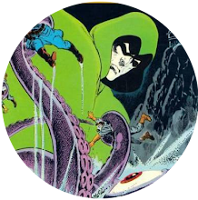
 |
| Hard-assed drama or dark comedy? |
Of course, this is Atlas, so that’s not to say they will be fleshed out (and I see, taking a peek at the Grand Comics Database, that next issue he seems to be wearing some sort of gimp outfit) but, in the hands of a good writer, they could be made interesting. There’s even a suggestion Targitt’s boss is crooked, a rare case perhaps of an Atlas title having been thought through beyond the first issue.
Despite my reservations about the way Atlas'll no doubt squander the strip’s promise, I’d actually like to see issue #2, to find out how it develops - and there haven’t been many Atlas Comics I’ve been able to say that about.


.jpg)


5 comments:
Steve:
The Atlas comic you liked — revealed! I haven't read this series yet, and now I'm really looking forward to it. FYI, if I remember right, Targitt was one of the few Atlas titles with a consistent creative team; at the very least, Nostrand draws all three. So maybe there's hope …
Cheers,
Andrew
ComicsBronzeAge.com
Actually, this wasn't the Atlas comic I liked - at least not initially. I read this the other day and thought it was terrible, mostly because all the Atlas comics I'd bought with it featured similarly violent heroes. I was somewhat violenced out. But, reading it again today, just before reviewing it, my eyes were suddenly opened to its surprising charms.
I actually liked some of the ATLAS Comics (as a kid) and Targitt was one of my favs - it was pretty violent - the second and third issues went the same way as titles like the Phoenix in that they made him a Super-Hero type "Jon Targett - Man Stalker" complete with blue hood & bullseye crest on his outfit - despite that the strip was still pretty good and kept the same artist.
If only Atlas had known when to leave things as they were.
The artwork did remind me of DC's early 1970's version of Shazam. The cartoony style does seem incongruous at first, but, once you get used to it, it does set the strip apart. And it makes the violence even more shocking, as it stands out in stark relief. Kind of like Joe Staton's art in Mike Mauser's solo strip.
Post a Comment