 I can't deny there's bad blood between me and Spider-Man Comics Weekly. It started when issue #1 came out and I excitedly opened it, all ready to take out and use the free Spider-Man mask we'd been promised -- only to be confronted by a red paper bag with two holes cut out the front.
What use was this to a man of my quality? How was I supposed to drive fear into the hearts of criminals, in such a garment?
Needless to say, that didn't stop me from wearing it while climbing on top of the washing machine. But still...
Then, in 1975, the comic mysteriously vanished from our local newsagents for several months, only to reappear just in time for it to kill Gwen Stacy. I need barely tell you I'm traumatised still by those events.
And then there was the title; Spider-Man Comics Weekly. I could never work it out. There was only one of it. So how come the plural title?
Still, in between such heinous misdeeds, I have to admit it gave me pleasure; bringing us the joys of Spider-Man and Thor before adding Iron Man to its roster. It then went on to ape The Titans' horizontal landscape format before merging with that very comic then regaining its vertical shape before being wrecked by ex-Starburst editor Dez Skinn who ditched the glossy covers and started to cram what seemed like a gazillion different stories into each issue. Sadly, by that point even I had to admit it was all over and the comic wasn't worth getting any more. It was a depressing end for what'd once been a cornerstone of Marvel's UK operation.
A couple of years ago, showing the sort of investment skills that'd make Warren Buffett jealous, I bought fifty copies of Spider-Man Comics Weekly. They've since been living where they like it, at the bottom of my wardrobe. Well, waste not want not. If they're not going to make me rich, they might as well be put to some use and, so, today I'm looking at the landmark issue #50. Next time out I'll be seeing how issue #100 compares.
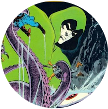
To open Spider-Man Comics Weekly #50 is to be flung into the world of that artist in The Fast Show, the one who kept going on about, "Black! Black! Everywhere black!" because the first thing that leaps out at you is the sheer quantity of black ink. It's everywhere. There's dotted Zip-a-tone here, stripey Zip-a-tone there, squiggly Zip-a-tone elsewhere. On top of that, some sort of anti-Vince Colletta's got loose on the thing. Whereas the mighty Mr Colletta would infamously white-out great chunks of artwork, someone here's been blacking out artwork on a spectacular scale. Clearly it was done to compensate for the lack of colour but it does exactly the opposite by rubbing your face in its absence.
 |
| Spider-Man, in the dark in more ways than one. |
It's a real shame because the thing's printed on what, to my untrained eyes, looks to be better quality paper than the original comics and with a better standard of printing. That, combined with the much larger page size, should make the stories look way better than the originals did. Instead, whole pages are rendered virtually unreadable. The odd thing is that none of this bothered me as a kid
Our lead story features Spider-Man vs Dr Octopus. Spidey's lost his memory, and Doc Ock convinces him that he and the tentacled terror are allies.
Next up, we get Thor in Asgard, vs the Absorbing Man, with just a little bit of The Demon thrown in. I believe the splash page for this is a panel from the previous issue blown up to a huge size, which was common practice in Marvel UK weeklies. Ironic that the story was inked by the aforementioned Vince Colletta, so you have an artist blacking out panels that'd previously been whited out.
But the issue's highlight is its third and final story. Up until now, the comic had featured just Spider-Man and Thor but things were a-changing at Marvel UK. With issue #48, the mag had switched to glossy covers and, with issue #50, Iron Man reprints were added. And so we get the story of how Tony Stark becomes the metal clad marvel. I still love this tale. Dated as it is, with its evil commies, its heroic American arms dealers and its Vietnam setting, there's still something about it that grabs me.
Apart from the Iron Man tale, the thing I most recall from the issue is there's a back page competition to design a super-hero.
I designed a super-hero for it. I think he was called the Masked Manhunter and had a costume that was a bit like the Black Panther's but with a long cape, and what looked like a pie tin strapped to this thigh. He was stood with his feet well apart as he prepared to draw the pistol from the holster on his other thigh. What the pie tin was for, I don't have a clue. Maybe it was in case he got peckish. Or maybe I thought it just looked cool.
The first prize was a colour TV.
Well, I say, "colour." Knowing Marvel UK, maybe it turned out to be a black and white one with loads of Zip-a-tone plastered all over it.


3 comments:
As much as I can now look back upon those UK Marvel weeklies and make snide remarks on how they butchered the artwork and chopped and changed so much you never quite knew who was going to share cover billing next (The Avengers, I'm looking at you) I can't deny that between that time I got my first Mighty World of Marvel (#11 in 1972) until about '77-'78, when I moved over to 2000AD and US Marvel issues, I lived for those comics. If I could get as excited about modern Marvel half as much I was, waiting for the latest UK weekly to drop on the mat of a Saturday morning... well, I'd be pretty excited.
It's true, Wil. Despite all their short-comings, I can't help but look back on those things with affection. And it's amazing how much of them I remember. Even reading the ads in this issue was like revisitng old friends.
It was down to the printing really. Why do I say that? Because it was the same guys who did the zip-tone in b&w American issues who did the British editions. The US ones turned out with interesting shades of gray - whereas, as you say, over here they were all a murky black. Some British printer didn't quite know how to work the brightness and contrast controls on his printing presses it seems.
Post a Comment