 |  |
Just as my ventures into the realms of ego-maniacal super-villainy mean I always need a good cover story, so every comic needs a cover.
This meant that, in the 1970s, as Marvel UK were reprinting material at a faster rate than it'd originally been published, they often commissioned brand new cover pics, to make up for the shortfall.
Sadly, apart from when Jim Starlin was doing the early Mighty World of Marvel covers, the newly produced efforts were a noticeable cut below the reprinted American ones, which meant that when we were given them, the "authentic" covers were all the more welcome.
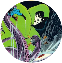
For the most part, they were reproduced fairly faithfully but there were exceptions like the cover to Avengers #79 in which the Vision was magically redrawn as Thor, and Spider-Man Comics Weekly #40 in which a whole load of white was suddenly introduced. But Rip Jagger's post on his "Dojo" today reminded me of this instance where Marvel UK drastically recoloured the cover to Avengers #59 for the front of their weekly Avengers #86.
Well, the fact I'm from the hometown of the World Snooker Championship and, as a youth, knew only a black and white TV, meant I grew up appreciating snooker in varying shades of grey - and black was my Hyperion.
Maybe that's slanted my perspective but I can't deny I've always preferred the Marvel UK recolouring of this issue to the original US one. In fact, when I first saw the US version, a couple of years back, I couldn't believe how tasteless and garish it seemed compared to what I'd been used to. To my mind, the darker background lends it a greater solidity and subtlety. I also dig the recolouring of the Wondrous Wasp's costume to match that of her dormant fiance. Marvel UK's efforts might have often left us with the fuzzy end of the lollipop but there were times at least when being British meant you got to get a good suck on its sweet end for a while.


4 comments:
I've just noticed that they've changed the position of one of the Vision's arms on the UK version. I wonder what the reason for that was?
They were probably supplied with a stat of the original artwork from before the change to the Vision's arm in the US version. In other words, the UK version shows the cover art as originally drawn, but not as originally printed.
I respectfully disagree with your assessment.
Having my spent my formative duckling years with the American version, I find the UK version drab and dull.
And the Wasp's costume is just wrong to what you'd see inside. I think making it the same colour as Goliath's turns her into a disembodied head floating beside the giant.
I think I'll agree with you that the UK black background, in the case anyway, is better than the US red background (just to much red, I think) but I much prefer the Wasp's US costume coloring. First, I just think the red + yellow is a great color combination, and second, I don't like her having the same colors as Hank, as it almost makes her disappear.
Post a Comment