Thanks to Charlie Horse 47 and Killdumpster for their sponsorship of this post, via the magic of Patreon.

But, occasionally, I got a reminder that Charlton wasn't only about Horror.
Unlikely as it always seemed to me, it occasionally did super-hero stories too.
And E-Man #7 was one of them.
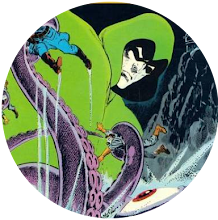
In the book's first tale, our alien hero has a problem. He keeps turning into fictional monsters and trying to kill his girlfriend Nova Kane.
It turns out this is all the handiwork of Michael, one of the Entropy Twins our hero previously encountered and defused by altering their body chemistry so they can no longer touch each other.
Apparently, this was to prevent their combined power of order and disorder from destroying the planet Earth.
Not happy about not being able to touch his other half, Mike's now out for revenge but, this being a Charlton Comic, none of it plays out like a Marvel or DC tale and it all ends with a cheery handshake and everyone being friends again.

The highlight of the story, for me, is definitely the scene in which Nova has a brief conversation with Midnight Tales' Arachne who's studying at the same university as her. Somehow, knowing the Charlton universe is intertwined gives me great pleasure.

Like E-Man, it's all tongue-in-cheek but the Ben Grimm style persona of the protagonist and the tale's Lovecraftian elements make it more memorable and it's interesting to see some early Bryne before the big-time summoned him.
Both tales are written by Nicola Cuti because all Charlton tales seemed to be written by Nicola Cuti. He must have been the busiest man in comics and it seems odd that such a ubiquitous figure at the company did relatively little work for either of the main two publishers.


17 comments:
I think the first E-MAN I picked up was #6. I’m a sucker for anything with Frankenstein on the cover. The Rog-2000 back-up was the first time I saw Byrne’s work and it was Love At First Sight. So bouncy and charming! When he started doing stuff for Marvel, it looked like they were deliberately trying to tone down his cartoonier aspects by having slick-but-kinda-stodgy Al McWilliams ink his first few Iron Fist books with a pretty heavy hand. Kinda like having De Zuniga smother Ernie Colon on Arak. Coulda been worse, I guess. They could have hired Joe Giella to sand down his rough edges (egad, what a thought). Fortunately, they loosened up and let Byrne be Byrne soon enough.
And as for Ubiquitous Charlton Writers, surely Joe Gill has to be Number One? I only WISH Nick Cuti had been that guy. Though he WAS pretty damn prolific, it’s true.
- b.t.
E-Man was a great comic in its own right and had some good back ups like the aforementioned Rog and Killjoy by Ditko. Ive followed E-Man for years through First, Comico and most of the other publishers but the Charlton run was the best. Pacific comics collected the Rog strips in one large magazine sized comic back in the 80s that is well worth picking up
Not a bad comic but I only bought Charlton comics when there were no Marvel, DC or Atlas alternatives.... Which was pretty rare.I too read the later Independant publishers featuring E-man but they merely made me appreciate how good the original series was! One lasting memory of the Charlton books was very clear images of the various shops that stocked them... including smells. Perhaps a sad indictment of this is I remember the shops more than the comics content!
I started with E-Man #1. Just the look and feel (not the cheap newsprint, lol) were enough for this young lad to plop down some pesos!
And there was something unique about E-Man and not just for Charlton, which by this time was basically war and horror. It seemed a little more sophisticated and intellectual. I mean, the comic above uses the work "entropy" for cryin out loud!
Don't worry about your supply of common sense Steve - its an over-rated commodity (I get by perfectly well without having any of it).
I preferred Rog-2000 to E-Man too, although I was a somewhat late arrival coming to them both through the Pacific reprint and First revival that Paul mentioned.
Don't know how the 80s E-Man compared with the original Charlton version, but while it was pleasant enough - complete with "mostest twinkies" ads! - it never quite did it for me. Joe Staton's artwork had its charm, but... it was a bit bland for my taste.
Rog-2000 wasn't exactly the greatest comic ever written either, but it did have John Byrne's early work going for it. Back in the day, I even liked his Charlton Space 1999!
-sean
"Entropy" was very 70s Charlie, back when we were expecting a new ice age rather than global warming.
It makes me think of Steve Gerber comics, and Michael Moorcock paperbacks.
-sean
I liked Byrne’s SPACE:1999 too — I probably would have even bought his one issue of EMERGENCY! if I’d seen it on the spinner rack (and I HATED that TV show). I quite liked DOOMSDAY + 1 also.
- b.t.
‘Entropy. Entropy. All winds down.’
Dear God, the crap that gets stuck in this brain of mine....
-b.t.
Tell me about it, b.t.
-sean
Well Sean, at the time Staton's work was enjoyable for this kid. But honestly, his work on Dick Tracy the past years just doesn't do it for me. It just seems inconsistent with how Dick's looked the past 80 years or so, but I can't explain it. Or maybe it's just the inking and coloring?
In any case, it'd be cool if you took a look and voiced your thoughts. You got waaaay more insight into this than I ever will.
Cheers!
Charlton deservedly had a reputation for super-low-end production values, even by shoddy 70s standards — but Mother of Mercy, look at the eye-gouging, off-register, bubbly colors on those panels. They look positively DISEASED.
- b.t.
Charlie, I doubt Joe Staton would have much control over how Dick Tracy looks. For a job like that an artist would probably be given a style guide to follow.
A look at the wiki tells me that Chester Gould retired in the 70s, and I expect since then any guide would have been "updated" at some point. Staton could have been asked to do that and redesign the strip himself when he started on it of course, but even so, he'd likely be given a brief for what the owners wanted.
I did a quick image search for Staton's Dick Tracy. The Spirit? Ehhh...
-sean
Thought Joe Staton inking Sal Buscema in Hulk around 195-200 and Avengers around 126-130 were fantastic,possibly his finest work!
Charlton Comics was a weird animal. As a kid I never knew quite what to make of it. My mother, who occasionally spoiled me, picked up comic or two for me at the supermarket ("at least he's reading SOMETHING") and I woulda preferred Marvel but sometimes I hadda settle for what I got.
What I got, sometimes, was Charlton horror comics; they looked like some guy was making them in a garage somewhere, but I dug horror and ghost stories too. Even a kid could tell the production values were a lot lower. Sometimes instead of a letterer they'd have some shmo on a typewriter. You'd get the idea these guys were barely making rent.
Last time I was in there, the local comic shop was selling old beat-up copies of comics like Ghost Manor and The Many Ghosts of Doctor Graves for a quarter a pop. You can't hardly go wrong there. Reading them is sorta mildly interesting and sorta mildly weird at the same time.
M.P.
Wow! Byrne did EMERGENCY!? If it had a photo cover I'm surprised my sisters didn't buy it, when they'd pick up their Sweet 16s & Tigerbeats. Guess Randolph Mantooth was a heart-throb, and my sister's had his pinups along side Donny Osmond & David Cassidy
I too didn't care for the show, b.t.
I'd occasionally pick up a Charlton mag, get some as presents, or read my friend's books. Dug the horror stuff, but also enjoyed E-Man & Rog-2000. That was my first experience with Byrne.
If they REALLY intertwined their universe, maybe they coulda lasted longer. E-Man meeting the Monster Hunters, Captain Atom, Yang, or even Hercules would have been fun.
Kinda lost interest when Nova got powers, though.
K.D. — Byrne did the art on EMERGENCY 1. Joe Staton cover painting, not a photo cover. I’m not sure I have it in my Charlton long-box, I’m thinking probably not. Still missing one of Byrne’s SPACE:1999s too, I think.
Like most of youse guys, I wasn’t terribly interested in the Charlton books. If it was a ‘slow comics day’, if I’d already picked up all the Marvels and the decent DCs at the spinner rack, I’d flip through the Charltons only if I was desperate for a comics fix. After a quick scan, I’d usually go ‘Eww’ and put ‘em back. They even FELT weird to the touch, kinda off-putting.
I once acquired a good-sized batch of comics from a friend who just didn’t want em anymore, and there were a few Charlton ‘Ghost’ comics in there, including a MANY GHOSTS OF DR. GRAVES and a MIDNIGHT TALES. I was aware of Ditko mostly by reputation at that point, and I hated his art on the cover and interior of DR. GRAVES. It looked rushed, sloppy. ‘This is that supposedly great Spider-man guy? Yuck.’ I was already a Wally Wood fan, so the Wayne Howard art in MIDNIGHT TALES tasted like weird ‘Near Beer’ to me. I’d stare at the panels and think ‘Well, it KINDA looks like Wood, I probably SHOULD like it, but I just DON’T” and couldn’t really figure out why it was so.
Long story short — I’ve developed a taste for the things over the years, have a fairly good size collection of em. I kinda love that DR. GRAVES that I hated as a kid. Still not a big fan of Wayne Howard tho.
- b.t.
The incredible power of nostalgia, b.t.
I also find Dr.Graves, etc, enjoyable reads. You're correct on them feeling cheaply produced. In my opinion they are better-spent reading time than the new stuff from DC or Marvel.
That's me being old.
Post a Comment