Thanks to Charlie Horse 47 and Killdumpster for their sponsorship of this post, via the magic of Patreon.
***
It's time, once more, for me to smash the past in the face, with heaps of Marvel awesomeness.

And I suspect his teammates will agree.
Thinking about it, it does pose an obvious question. With this kind of scientific knowledge, why has Hank not simply built an indestructible adamantium robot to fight super-villains? If he did that, the Avengers could practically retire.

Of course, that means he's going to have to kill our hero.
Our hero's not too keen on that plotline and decides to come up with a few story ideas of his own. Most of them involve him hitting the Red Skull in the face.
Elsewhere, the recently deceased Nomad's publicly outed as a phony, and a movie executive pulls the plug on his own plans for a Captain America film.
Also, the Ameridroid dies doing heroic things.

The trouble is that seemingly every villain in town, plus Elektra, wants to have a word with Stick, as well, leading to an awful lot of conflicty people in one place at the same time.
I have a feeling that situation's not going to end peacefully.

Only to discover, when he gets there, that she doesn't need rescuing because she's there to rescue someone else.
Anyway, it all ends up with Shellhead getting zapped by the Living Laser - and now he has stuff to worry about.
I do believe this is the issue in which Bethany finally tells Iron Man that she knows he's Tony Stark.

That's the Whizzer from the Squadron Sinister, I should point out. Not the one who used to fight Hitler in the 1940s.
With his new-found self-respect in place, the villain goes on a spree, robbing department stores.
A spree which only lasts for as long as it takes Spidey to web up a few department store exits.

However, everyone thinks it's the Gibbon who's defeated the wrongdoer and it's he, therefore, who gets all the plaudits.

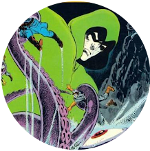
There's also a giant monster blundering around New York who I think has been unleashed by Loki and is out for revenge against Thor who once defeated him in his salad days.

We can only hope so, as her parents decide Professor X's academy isn't the best place for her and, therefore, transfer her to a far better school run by Emma Frost.
Given that Emma's an evil super-villain, this is clearly not a good idea.
So, Storm accompanies her to the place - only for Emma to perform a psychic mind-swap, leaving Storm trapped in Emma's body, as Emma - in Storm's - heads for the X-Men's HQ, looking to destroy the heroes.

Conan heads back home and bumps into a childhood friend who's now married to a woman from Khitai who's actually a witch and is mixed up in some supernatural shenanigans or other that Conan just can't avoid getting caught up in because he's Conan and that's what he does.

It turns out it's all down to a plan by the Puppet Master to give Alicia the, "normal," life she couldn't otherwise have.
Except, like a mug, he's brought Dr Doom onboard to help him set it all up.
And, of course, Doomsie couldn't care less about Alicia's happiness - or the happiness of anyone else either.

And that means it's up to the spontaneously arranged new super-team the Rangers to stop the green grappler.
Except, of course, that's way beyond their skillset.
But it's OK because, somehow, everything's resolved and it all ends happily.
I suspect Rick Jones probably just appeals to the Hulk's good side enough times for it to finally work.
That's how these things usually go.


32 comments:
Theres not a lot you can say for these covers Steve, despite Gil Kane and Frank Miller (who obviously needed to work on his perspective).
The only good one is Byrne's FF #236, but I can't in all conscience make it my cover of the month, not when it has Stan Lee in the background but no Jack Kirby. Tsk tsk, Marvel.
So what wins it? Legion of Superheroes #281.
Hey, it was a pisspoor month at Marvel - just look at the Lucky Bag the other day - so I checked out DC in Nov '81 at Mike's World of Comics instead. At least half of their covers seem to have been inked by Dick Giordano, so at least they looked competent.
And putting George Perez on LSH is a no-brainer. So much so, you have to wonder why he never drew the inside (so far as I know, anyway).
-sean
PS I should add that DD #176 was a great read inside though. And that FF too.
-seab
You know its a funny evening when you can't even sign your name right.
Duh. How embarrassing.
-sean
Seab - no worries. I figured you were Sean!
And the only one of these Charlie ever read was the FF one.
IIRC this is where the wee villagers (I guess they are mini robots?) are seen chasing wee Doom around the village, as the story concludes, and he is hoping they run out of battery life?
Really it is a solid issue! There aren't so many comics that I've read as an old man that kept me engaged, but this is one of them.
Were I a younger kid, the DD, IM, and PPSS covers would have drawn my attention. I think they are decent action covers.
After reading the moaning and groaning last week about the square frame on the 50-years-ago comics restricting the cover, old Charlie has to say...
The square frame never bothered me. It seemed to draw my attention to what was being framed.
These covers, with their bar codes, advertising banner for a bicycle, word balloons, and the random CCA box, really seem to detract from the art. Cute the CCA box is titled in the whizzer's whirlwind, lol.
Relevant that only Cap's cover has a word balloon? Were words becoming out of fashion on covers?
I agree with Sean, there are a lotta low cards in this hand, Steve.
The exceptions would be Daredevil and the F.F.
I've always been ambivalent about Byrne, who has a very high opinion of himself for a guy who wrote about characters and themes somebody else came up with, but least he was doing SOMETHING with the F.F., which had been moribund for years.
I would guess that would be a hard comic to write. With Spider-Man all you gotta do is come up with some animal-based villain or some goon with fancy hardware and call it a day.
M.P.
I must have been flush this month because I had Avengers, Cap, Daredevil, FF and X-men, although I'm now only two issues away from dropping Avengers and Cap. The FF story was great and I recall they printed a back up story created from Kirby storyboards for the animated series (with Herbie the robot). I remember thinking it odd that they didn't simply get a new story until I read an interview with Kirby, a few years later, where he confirmed they approached him and he told them to get !@#$%!
I quite like Miller's Peter Parker cover and note that Cap's cover was also used by Marvel UK this month (previous post). Story wise, Daredevil still wins every month for the next year or so. Having just checked all the covers from November 1981 I also bought Cerebus #32, which I must have found most confusing because I didn't buy another issues until the 500 page High Society collection came out in 1986.
DW
Frank’s PETER PARKER cover is the best one he’s done in awhile. His DAREDEVIL cover is just way too busy and DD himself is oddly foreshortened. Is there something wrong with me, that I never popped a Nerd Boner whenever ninjas showed up in a comic or movie of video game or whatever? Everyone else I knew at the time was all “OMG NINJAS!!!!” while I would just scratch my head. Possibly it has to do with my very first ninja being a particularly lame one in the pages of IRON FIST. But honestly, I could never figure out was supposed be so “KEWL!” about them. I was never particularly keen on dinosaurs either. Shrug!
The Gil Kane CONAN cover is probably my fave of these. It has a neat, off-kilter composition, the color scheme is moody, and the zuvembies remind me of the good ol’ days of JUNGLE ACTION and BROTHER VOODOO.
b.t.
Wow, the 20th Anniversary of the FF . Back when twenty years seemed like a long time.
Stebe, can we all sign our names with misplaced B’s just for today, in honor of seab’s spelling gaffe?
b.b.
The 'b' key is right next to the 'n' ffs. Its easily done n.n., ok?
Generally I like Gil Kane on Conan, but my problem with that cover is that our hero and the zombies look way too small. Mind you, if thats supposed to be a giant sword on the ground then I guess its better than I thought.
DW, were you not at least amused by the Moon Roach? (I think thats Cerebus #32)
"Unorthodox economic revenge..."
-sean
Sean, Bt, DW, MP, Charlie, thanks for your comments.
Sean and Bt, the thing I can never get out of my mind when I look at that Conan cover is its resemblance to that Kane drawn scene in Panther's Rage where the villains, disguised as corpses, climb up out of the ground to confront our hero. Because of it, I keep feeling like Gil's swiping from himself, even though he isn't.
Bt, let's face it, if they were any good at being ninjas, we wouldn't even know they were in the comic.
My nomination for Cover of the Month is the Peter Parker one. It has a drama in its lighting which appeals to me - although Spidey does seem to be standing on thin air which is not a power I was previously aware he possesses.
O sean, my brother from an Irish mother, you know I tease with respect and affection. I spend half my posting time changing “tge” to “the” , and for some reason I’m forever hitting the “i” key when I want an “o” .
It’s been eons since I read that issue of Conan, but I do believe it IS an enormous sword, kinda like the Hyborian equivalent of the Odinsword or something.
b.t.
Steve:
Yes, that sequence in the ‘Panther’s Rage’ serial was exactly what I was thinking of. A month or two before that one, fake zombies showed up in the Brother Voodoo strip (Colan on the inside, Kane on the outside) too. They were actually A.I.M. agents in disguise in that one, IIRC.
And I agree about Frank’s Peter Parker cover. That “rotten cheese” texture on the cityscape is kind of a prelude to the grungy futurist style he’d be using on RONIN and DKR in a few years.
b.t.
“We Are All Sbartacus!”
No worries b.t. - that may have come across a bit more seriously than I actually intended.
That scene from Panthers Rage popped into my head too. The Conan cover could do with some of the atmosphere it had (although I suspect a lot of that was down to Klaus Janson's inking).
Gil Kane quite often used the same/similar figures and compositions in his work, Steve - as an artist he was very methodical like that.
-sean
Steve - FF #1 was 60 years ago this month.
I can't recall if your 50-years-ago started early enough so that it now overlaps with what is 60-years-ago?
Just a thought... you are the Maestro after all... would you consider doing 60 years ago (don't need commentary per se) since your UK weeklies are stopping soon (as I understand things).
Last week Steve talked about the movie Duel about a car chasing down Dennis Weaver in his car in the California desert.
There is a decent copy on Youtube. I watched with my son and his buddy a few years ago. Though it was made 50 years ago, it kept their undivided attention as 20 year olds.
Marvel's new Conan The Barbarian (launched in 2019) recently ended after 25 issues but #25 was also the 300th issue of CTB since 1970 so it was a bumper-sized celebratory issue to end on. King Conan #1 is launched in December.
Just call me Colib.
Steve:
True that Kane had certain artistic ‘formulas’ that he would use and re-use over and over. Most artists had specific poses and compositions in their tool kit that they could rely on to help them crank out the pages. Buscema, Kirby, Colan, Romita, Tuska, all of ‘em. The most egregious examples are Wally Wood with his organized swipe files and re-use files, etc. Sal Buscema and Dan DeCarlo were both guilty of doing the same poses and compositions over and over too.
Steranko was the one guy who prided himself on NEVER relying on formulas. That need to always be blazing new trails and being innovative every time at bat eventually hampered his output. Every mountain had been climbed, every challenge met! I think that Superman story, told as a series of two-page movie-poster-styled spreads, was his last full-length comics work, and that was like 30 years ago already.
Sean:
That run of Conan is a good example of Kane not being his own best inker. Once he started using felt-tip pens to ink, his work really suffered, IMO. He really needed to have a Janson or Sutton or Palmer to add dimension, lighting, variety of textures, etc. There was a SSOC story pencilled by Kane and inked by Redondo that looked REALLY sweet.
b.t.
Sean
With hindsight that issue was great as it featured Cerebus, Astoria, the Elf and Moonroach all really nicely illustrated in Sim's pre-Gerhard style. I'm guessing I picked it up based upon the art but was completely lost by the story. When I read the High Society collection, five years later, in one go, it literally changed my view on comics. Sim really was an A grade creator back then. Shame how it turned out...
DW
I wasn't aware Kane used felt pens to ink his strips but looking back I can see that may have been the case. Like b.t. I liked to see Gils work with other inking his work like Romita etc.that were sympathetic to his style, artist like Tom Sutton inking Kanes pencils in Warlock et c didn't do it for me . My favourite inker for Kane was Neal Adams they both did great work on Savage Tales 4 a cracker of a comic. Saying that I liked Kane work ( pencils and inks) on his Star Hawks strip.
Yes, overall a rather forgettable week at Marvel. But that FF issue truly aced it! One of the best "Anniversary Issues " ever. Great cover and great interior.
Cover-wise, I did (and do) like that Iron Man cover. Almost monochromatic. Back when "stealth armor" wasn't something that everyone and his Aunt May had.
McScotty- quite so, that Kane/Adams Conan tale was a beauty. A visual blend as satisfying as Kane/Romita. That said, the Kane/Redondo story that b.t. mentioned sounds wonderful too.
"Rebartz" (maybe not such a good idea, might give the impression that I'm flying a Confederate flag in my comics den)
DW, yeah, Cerebus was great - I've never read anything else like it around the time of 'High Society' and 'Church & State' (From Hell has the same kind ambition, but doesn't have any jokes).
I actually read all the Cerebus books during lockdown last year (well, apart from the text only bits of 'Reads' - zzzzzzz) and decided the later stuff is underestimated. Even when he's iffy, Sim is still interesting.
Admittedly you really need a worldwide pandemic to justify the time it takes to get through though.
-sean
Btw, looking at other comics with a Nov '81 cover date, Captain Victory #1 came out this month. I think thats the first of the new direct market colour comics from an indie publisher, which seems worth noting.
Jack Kirby finally has a comic out that he owns the rights to - yay!
-sean
I should amend my comments about Kane inking his own pencils.
At worst, the felt-tip inks lacked variety in the line-weights, giving everything a somewhat monotonous, unpolished feel. And when he was really cranking the pages out, oof, you could tell. The 5 or 6 issue Conan run (like the story underneath this week’s cover) is very un-inspired, he’s re-using many of his standard tropes and the inks are flat, flat, flat. There’s a short back-up strip from SSOC called “Chane” that he wrote, pencilled and inked that may be the weakest, most obvious “doing it just for the pay-check” thing he ever did.
But even in his “Felt Tip” Period, he could still knock it out of the park when he wanted to. The SWORD OF THE ATOM series looks nice, and most of those Superman stories he did in the late 80s are dynamic, exciting and fun. I mostly liked his STAR HAWKS stuff too, he seemed to be having fun with that strip.
But I do still think it took other inkers to truly accentuate the positive qualities in his work. Dan Adkins on his CAPT. MARVEL run, Joe Sinnott on a handful of TWO-IN-ONES (and lots of covers), John Romita on Spidey, etc. I thought Adams inking Kane wasn’t the best combo, personally. I thought his first JOHN CARTER, WARLORD OF MARS inked by Cockrum looked fab. Don’t get me started on the Rudy Nebres issues though…
b.t.
Oh, Dick Giordano inking Kane on that first IRON FIST story — (chef’s kiss)
b.t.
Sean, personally, I think Sim is a lunatic.
M.P.
I forgot about Giordano inking Kane on that first Iron First strip, that was an excellent comic and a great art combination . I tend to side with M.P. on Dave Sim, great artist though
Thats a fair point on Dave Sim M.P. But the best comic creators are lunatics (except Will Eisner, who seemed unusually sane).
Also - at the risk of getting b.t. started - Rudy Nebres was Gil Kane's best inker.
Actually, he was pretty much everyone's best inker. He even made Sal Buscema's work look stylish.
-sean
I loved Sim’s CEREBUS run for several years, when it was still a goofy sword-and-sorcery / superhero parody, and I thought Sim’s art style was unique and appealing, but I lost interest after awhile. As the series’ reputation continued to grow with critics and fans, I started reading it again (near the start of the “Gerhard Era” I guess), but after a few issues I found the dense, serialized story-telling, and the darker, more serious tone just not to my taste.
I found myself arguing about Sim with a (slightly drunk) Canadian lady at a convention once. She apparently knew him personally, was heatedly defending his work (which I wasn’t tearing down) and down-playing his oft-stated misogynistic views on women, online and in numerous interviews. I asked her if she was okay with his repeated assertions than women are just flat-out less intelligent than men. She got right in my face and barked, “Well, they ARE!” At that point I knew I was beat and withdrew from the battlefield.
As for Rudy Nebres, I’ve never heard of him say anything bad about women.
b.t.
‘…SAYING anything bad about women’. Dammit, ruined my own attempted witticism. Clearly mine grammar not good!
I liked Nebres for a hot minute when his work started showing up in various Marvel books. But I quickly got tired of his super-heavy inking style. No matter whose pencils he was inking — Kane, Infantino, Cockrum, Ernie Chan, either of the Buscema Bros, whoever — it all just looked like Nebres when he was done with it. The sh*t printing quality of the time didn’t do him any favors, either.
Fun fact: Nebres inked John Byrne’s first published Marvel story (a throwaway stand-alone backup in GIANT-SIZE DRACULA #5). Aside from a Dutch-angled panel or two, there is virtually no trace of Byrne’s style in its eight pages. He also inked several THE FLY covers by Ditko at Archie/ Blue Ribbon that actually look quite nice. What they DON’T look like — not even a tiny bit — are Ditko covers.
So — a solid professional, undeniably talented, etc. Just not my cuppa.
b.t.
McScotty, Redartz, Colin, thanks for your comments as well.
Charlie, I fear the site's too jam-packed with goodness for me to be able to squeeze in a 60 Years Ago feature. However, My 50 Years Ago post covering FF #1 can be found here: https://stevedoescomics.blogspot.com/2011/11/fisfty-years-ago-today-sensational-new.html
Post a Comment