Thanks to Charlie Horse 47 and Killdumpster for their sponsorship of this post, via the magic of Patreon.
***
Let us revisit the past and see what it has to offer us.
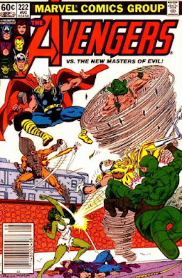
And so is the Scorpion!
And the Whirlwind too!
And probably one or two others, as well.
If I remember rightly, they've been recruited by Egghead to do something or other but I don't know what.
Regardless, I'm more than sure the Avengers can deal with them.
The Falcon, meanwhile, is out to eradicate the scourge of drugs from his local neighbourhood.
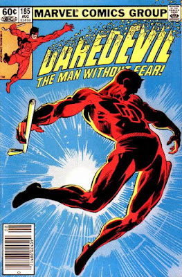
This leads him to a confrontation with the Kingpin who Foggy tries to bluff into cooperation by pretending to be the most dangerous man in New York.
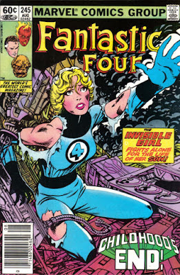
Fortunately, it all gets sorted out and the whole thing concludes with the Thing regaining his rocky appearance from the Kirby/Buscema years.
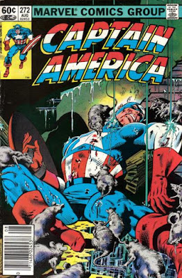
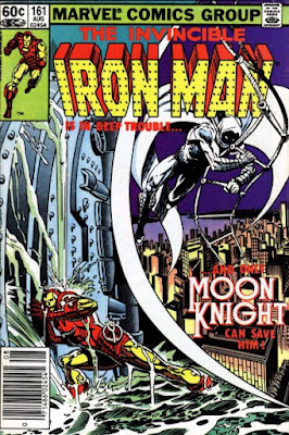
With time - and air - running out, it looks like it's up to Moon Knight to rescue them.
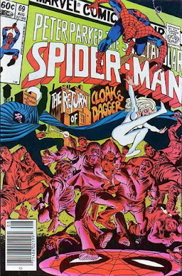
I would assume they're still out for revenge against someone or other, even though they brought justice to their enemies when they last guested in Spidey's mag.
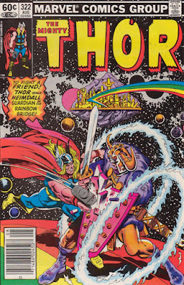
A strangely low-key Odin has to prevent a battle from breaking out on the fringes of Asgard but it all gets sorted by Thor and the group of demigods known as The Menagerie.
That done, the members of that ensemble agree to restore their host bodies to their original human form.
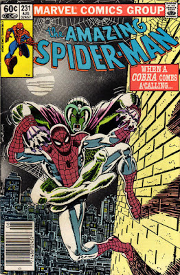
Given that he didn't manage to give Spider-Man any problems at all on the last occasion they met, I doubt the herpetological heel will fare any better this time.
Then again, he does still keep losing his temper and threatening to smash people.
I would say this issue's main claim to fame is that it's entirely drawn by Alfredo Alcala with no input at all from his sometime partner John Buscema.
Sadly, I can shed little light upon the story itself, other than that it features a large but witless man who turns violent whenever he hears a certain tune being played.





14 comments:
ASM #231 is pretty good for a post #180 issue and one featuring the cobra. All the way through the comic there's a background story going on with a hulking Juggernaut-shaped brute stomping around in the shadows looking for some unnamed skinny guy that he can get his revenge on. All written and drawn so that the reader thinks it's Juggernaut seeking revenge on Spider-Man. Until you get to the big splash page reveal at the end when it turns out to be…………Mr Hyde seeking revenge on the cobra.
After so many stories over the years with the kingpin being behind the scenes and the creators making little effort to hold him back as a surprise, this was a great bait and switch.
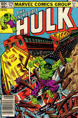
Cap must win best cover this month. FF cover is pretty good too, but the art and words are too Barney for my tastes.
Best cover to Spidey with Cobra. Thats my vote. In general it is a great bunch of covers though. CH47
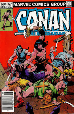
The CONAN cover is easily my fave here. Big John seemed to be on auto-pilot on the Conan interiors thru most of the 80s, but he usually did a great job on the covers, especially when he inked them himself (like this one). The color is excellent too.
Byrne’s FF cover is really good, and the PETER PARKER and DD covers are both striking. I think those are the only three comics I actually bought out of this batch.
b.t.
I'm with b.t. on that Conan cover, and John Buscema doing his own inks.
Unlike big John though, I am an enthusiast for the work of the mighty Alfredo Alcala, so I've just been reading that issue online.
It looks great of course, but also Bruce Jones is quite a different writer to Roy Thomas and obviously not as invested in being 'Howardesque', so theres a different feel from usual (so far as I remember Conan comics anyway).
Theres actually no magic or anything in the story, which is something I was always surprised they didn't do back in the day - I mean, does Conan ever get up to anything without a wizard or demon being involved? Why not vary the series a bit, and keep the reader guessing?
I suppose Roy Thomas thought sword & sorcery ought to involve a bit of sorcery, which is a fair point.
But it is a refreshing change to just have Conan trying to make some dosh as a Hyborian equivalent of a bare-knuckle fighter without having to deal with some walking skeletons back from the dead, or giant snake or whatever.
Although I wouldn't want to accidentally create the impression that the story is actually any good.
Mind you, I did like Jones introducing Conan with a scene set in the 'pub' rather than a 'tavern'.
-sean
While looking up who drew that Peter Parker cover - Ed Hannigan apparently (its nice to see him at least trying to do something interesting) - I found out that, like the Falcon, Cloak & Dagger were trying to eradicate the scourge of drugs Steve.
Wasn't Daredevil also doing that in the last couple of issues of his comic?
Its a wonder there were any drugs available in Marvel New York at all with all those super-heroes around, interfering in other peoples' business.
Bleedin' killjoys...
-sean
Alfredo Alcala was the artist on Marvel's adaptations of Beneath and Conquest Of The Planet Of The Apes.
I have that Alfredo Alcala illustrated Conan comic. The art is of course top class but Conans face at times doesn't look like Marvels ( John Buscemas) Conan. Still it's a great issue . I love Alcala's Planet of the Apes art Colin, some of it is sublime.
That Peter Parker/Spectacular Spider-Man issue was good, and the cover is great. It takes my vote for cover of the week. Ed Hannigan is one of those 'under the radar' artists who actually do fine design work.
Fantastic Four was consistently good during this era, Byrne really had a feel for Marvel's First Family.
To somewhat depart from your thread: this evening our local public radio music station was saluting ABC's "Lexicon of Love " on its 40th anniversary. They had Martin Fry on with an interview. Had to come home and play that disc. Ahhh, 1982. Good comics, great music, art school- oh, the memories!
Barney -> Byrney
How do people feel about later issues of DD, when Klaus Janson pretty much took over art duties? I personally like them a lot - despite a lot of dodgy anatomy and flawed fundamentals, the murky look of his inks and colours really work for me. And just occasionally there’s an amazing panel that looks beautifully cinematic: usually a moody close-up.
I even really like the handful of post-Miller issues he did. I’m counting down the years until Marvel Masterworks reaches that far and they get reprinted.
Miller's anatomy was never that great anyway Matthew, and Klaus Janson - who did fantastic lighting and, as you say, had a distinctive colour sense - did a lot to make him look good anyway, so I didn't think there was that much difference. Except I didn't notice any figure swipes, and Janson's work tended to be a bit bolder.
Fwiw though, I thought Miller's Daredevil was at its best a bit later, when he handed the drawing over completely to David Mazzucchelli.
-sean
Bt, Charlie, Dangermash and Red, I would say Amazing Spider-Man is my favourite of this month's covers.
Matthew, Klaus has my vote of approval.
Sean, Colin and McScotty, I especially liked Alcala's work in DC's mystery mags like Weird War Tales.
I thought those late DD issues were great as I think Miller's strength lay with his layouts. His figure work, as mentioned, could be dodgy, which was probably the reason his covers were often weaker than his internal pages. I didn't realise at the time how much he was riffing on Eisner. I was pleasantly surprised at the first couple of Janson's solo issue, but they quickly went south. Hadn't he gone after four or five? Agree re. Miller/Mazzucchelli. A fantastic combination.
DW
Around the early 80's my comics' reading was sporadic at best. I do recall the ASM issue, though, as the Cobra was one of my fav silver-age villains. He had few good writers.
Wish I would've seen AVENGERS #222, as there seemed to be some cool bad guys in it ( with the exception of Moonshine, or Moonstone. Whatever).
--Killdumpster
Post a Comment