Tuesday, 17 August 2010

Logan’s Run #4. The future’s so bleak…

Marve Comics, Logan's Run #4, George PerezClassic 1970s sitcom Whatever Happened to the Likely Lads? always claimed, “The only thing to look forward to is the past.” Clearly, 1970s Hollywood had a similar take on things, as movie after movie told us the future was so bleak we’d have to wear shades - to make sure we couldn’t see it.

Our stomachs would be filled with food that was really people, sports would involve men killing each other on roller skates, and any robot you met at a theme park was guaranteed to try and murder you.

Sharing such joyous optimism was Logan’s Run where the local council killed anyone over the age of thirty. And I thought my local authority were tyrants for making me have two different-coloured wheelie bins.

In truth, the closest I got to seeing Logan’s Run in the cinema was watching a trailer for it while waiting for the similarly pessimistic Futureworld to begin. This means my first exposure to the story came not through the movie but from the Marvel comic of the same name.

Logan's Run #4, dead and frozen
I have to admit I didn't at the time see Marvel’s movie adaptations as being proper Marvel comics - existing as they did in a separate universe - and therefore didn't buy them. This means my one copy of Logan’s Run was bought for me by a grown-up, to whom comics were comics, with no differentiation between real Marvel and fake Marvel.

In the end, I’m glad they did because it’s surprisingly good. It’s drawn by George Perez, and written by Dave Kraft, a man whose name never seems to get shouted from the rooftops but I always seem to enjoy everything I encounter that he wrote. This particular issue covers the most important section of the movie, the one where they meet a homicidal robo-sculptor called Box, Jenny Agutter gets them out for the lads and we meet Peter Ustinov.

Logan's Run #4, Box sculpt
It has to be said no one in the comic actually looks like they did in the film - Jessica, for instance, looks suspiciously like the Wondrous Wasp - but it’s a beautifully executed comic that packs panels in ten-to-the dozen while never losing sight of its story-telling principles. I also have to praise Klaus Janson’s inking and colouring which, to my pitiful eyes, seem a perfect match for Perez’s pencils.

In the end, the future did arrive and, because of that, I finally got to see the movie.

And you know what?

No way was it as good as the comic.

But the comic came after the movie. That means it was from the future. That means the future was better than the present.

Hollywood, however could you have got it so wrong?

Logan's Run #4, Box dies

Saturday, 14 August 2010

Rampaging Hulk #4. The way things are going...

Rampaging Hulk #4, Jim Starlin)Whatever the greater success of other incarnations of the Hulk, I can’t deny I’ve always had a soft spot for the short-lived version that spoke like a cross between Al Capone and The Thing. You might not have wanted to be stuck in a lift with him but there was something appealingly Kirbytastic about the sight of him calling Rick Jones a punk or Betty Ross a broad.

Well, lucky me because, in Rampaging Hulk #4, we get to see that version make his comeback as the un-jolly green giant’s transported to a world of magic by the sorcerer Chen K’an who restores that old persona so they might better communicate.

It seems K’an needs Hulkie’s help to defeat a wicked witch and, as we all know, the Hulk can never say no to a fight.

It’s a nice, if fatalistic, tale and, being drawn by Jim Starlin and Alex Nino, looks beautiful - though I could do without the grey washes designed to compensate for the lack of colour. It reminds me too much of what they used to do in those UK Marvel weeklies that I’m always moaning about. It’s done with a lot more style and subtlety here than in those but, still, the simple truth is art this stylish is only marred by such tactics.

Rampaging Hulk #5, Jim Starlin, Alex Nino
The back-up story features a character called Bloodstone who, until I reacquainted myself with this comic a couple of years back, I’d totally forgotten about.

To be honest, I’m not surprised I’d forgotten about him. From what I can make out in this issue, he seems to be some sort of cross between Doc Savage, Manhunter, Ka-Zar and Dr Strange, which is a heck of a confluence of influence.

I have to admit I don’t have a clue what’s going on in the tale or who anyone is but there seem to be big things at stake and it’s certainly nicely drawn by Val Mayerik and Sonny Trinidad.

I get the feeling from what's on show here that the run would benefit from being pulled together into a trade paperback where one could see the whole thing unfold before one’s eyes so it might finally make sense to the likes of me but I don’t know if it ever has been.

The thing that strikes me about this issue, as it does with a lot of Marvel’s black and white mags, is there seems to be a fair bit of padding, with single page pin-ups a-go-go. It’s hard to see who they’re aimed at as I would have thought such things would appeal most strongly to younger readers, whereas the magazine format was supposed to be aimed at the more mature.

But that Jim Starlin cover!

Let’s face it, if you don’t dig that, tiger, you don’t dig comics.

Thursday, 12 August 2010

The Son of Satan in Marvel Spotlight #13. Families at war.

Marvel Spotlight #13, the Son of SatanIf there’s one thing we all should learn in life it’s never to read other people’s diaries. Like that mirror of the soul the Phantom Stranger was always going on about, you’ll rarely be pleased by what you see in them.

In his second adventure we learn how the Son of Satan first came to learn he was the Son of Satan. Admittedly you’d have thought that being called Daimon Hellstrom, having a sister called Satana, having a great big pentagram on his chest, pointy ears and hair in the shape of horns might have all have been pretty big giveaways but our Daimon’s clearly none too bright and it seems he only found out when he read it in his mother’s diary.

Obviously her diary was somewhat more interesting than the one I tried keeping when I was younger because it seems to carry no references to anybody’s new albums or having once seen a bloke at the local Jobcentre who looked a bit like half-forgotten Olympic steeplechaser Colin Reitz.

The plot of this issue is to a large degree a retread of Marvel Spotlight #12, in which our "hero" goes to Hell and steals something from Satan. Last time out he stole Johnny Blaze and some woman. This time he steals something far more valuable; Satan’s horse and cart. He also steals his trident whose metal is the only thing that can weaken Satan. Why Satan carries a trident made of a metal that weakens him is never explained. With a level of critical analysis I never had as a kid, it now strikes me as being like Superman carrying a sword made of Kryptonite.

But, as today’s teeny-boppers say, it’s all fab stuff. SOS hasn’t mellowed yet into being an out-and-out good guy - although he’s already more morally compassed than in his first outing - and Herb Trimpe’s overwrought pencilling’s perfectly suited to the subject matter, while Frank Chiaramonte’s inking’s perfectly suited to Trimpe’s pencilling. Virtually every character looks as though their soul’s been wrung out like an old dish cloth and their bones are about to burst through their skin.

And, if the whole thing’s totally derivative of The Exorcist, The Omen and Rosemary’s Baby, somehow it doesn’t matter. All that matters is Satan’s in it and, as Samuel Johnson never got close to saying in his own diary, when a man’s tired of Satan he’s tired of life.

Tuesday, 10 August 2010

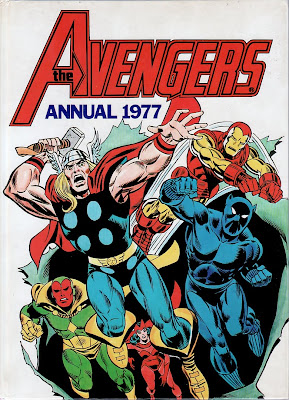
Avengers Annual 1977. Better late than never.

Marvel UK, Avengers Annual 1977I could claim the Avengers Annual 1977 was a treat that helped light up Christmas Day 1976.

But it wasn’t.

Not because it wasn’t any good but because my dad totally forgot he’d bought it and only remembered several weeks later when he found it in the airing cupboard and realised what he’d done. Thanks to this not totally atypical oversight, it means I got a little piece of Christmas 1976 sometime around March 1977.

So, was it worth the wait?

Of course it was. It was the Avengers. It was Marvel. It was 1977. How could it not be?

It kicks off with a double-length epic in which the Avengers come up against the threat of Nuklo. Like a giant vampire duck, Nuklo’s dramatically billed. He’s billed as, “the monster that time forgot,” and is big, strong and radioactive. His deadly radiation doesn’t seem to bother our heroes who seem quite happy to run up to him and punch him at every opportunity. As none of them have lost their hair or teeth by the end of the tale I can only assume that even the non-super powered ones are quite immune to deadly radiation.

The tale’s drawn by Rich Buckler in his flat-out Jack Kirby style and so can’t be said to look stylish but his story-telling sense is strong and the main draw of the thing is the revelation that Golden Age hero the Whizzer is the father of Wanda and Pietro. I suppose, bearing in mind his power of super-speed, this is hardly a shock but it’s appropriate and gives us a potted history of the Scarlet Witch and Quicksilver, tying them pleasingly into the High Evolutionary. As a kid I always had the idea that Quicksilver was a super-evolved cheetah from the Evolutionary’s kingdom of Wundagore, so the official link with him was a good thing for me even if it wasn’t in the way I’d imagined.

I believe the Marvel Powers-That-Be later changed their mind and decided the Whizzer wasn’t their father after all but I choose to ignore that, as it’s one of those inconvenient truths I can live without. The main plot about the Avengers’ battle with Nuklo isn’t quite as interesting as the Whizzer subplot but it has a certain vigour to it and at least Mantis is slightly less annoying than usual here.

Next we get a Conan the Barbarian tale which is basically the same story as we got in his comic pretty much every month, in which he has to rescue a fit bird from a giant crocodile summoned by an evil wizard. It’s as beautifully pencilled as ever, although I was never big fan of Buscema’s inking which generally used too thin a line for my liking.

Given that every woman Conan ever rescued was drop-dead gorgeous, I do wonder if Conan simply refused to rescue any of the ugly ones, hence the lack of stories in which he did so. He seemed to be practising a mad sort of eugenics in which all the ugly women got eaten by monsters while the fit ones survived, meaning the world would soon be populated entirely by the firmly knockered.

Finally, the Two-Gun Kid teams up with the Avengers to fight Kang the Conqueror in the Wild West. Kid Colt’s there too but for some reason disappears without trace or explanation after the first two pages. Given that, to fit it into the annual, pages have clearly been cut out, I’m not sure if his disappearance is down to pruning by the annual’s editor Jim Salicrup or if that’s what happened in the original comic.

Because it’s a segment of a multi-part tale and therefore it’s not totally clear just what’s going on or why, it’s probably the weakest choice of story in the annual although in itself it’s clearly a nice tale and does feature the death of Kang.

Why do I get a feeling he probably didn't stay dead?

I’m trying to wrack my brain to remember exactly what strips were featured in the Avengers’ weekly comic in the Autumn 1976 period when this annual came out. I think Dr Strange was long gone. Was Shang-Chi still in it? If so, it’s a bit of a shame we didn’t get to see him instead of a somewhat butchered Avengers story.

Oh well, beggars can’t be choosers and if my Christmas 1976 arrived in instalments, perhaps it was appropriate that it ended with a tale that itself was a final instalment of an earlier event.

Friday, 23 July 2010

Spider-Man Comics Weekly #100.

Marvel UK, Spider-Man Comics Weekly #100, poster, Spider-Man's foes

Marvel UK, Spider-Man Comics Weekly #100 cover, John RomitaIt's January 11th, 1975, almost exactly a year since the treat of Spider-Man Comics Weekly #50, and the mag finally hits the big ton. So, seeing as we've reached a true landmark, how have things changed in the last 50 issues?

In terms of content, it's a bit difficult to say as, this being a special issue, the whole thing's dedicated to Spider-Man, meaning no Iron Man and no Thor.

First we get the concluding part of our hero's latest clash with the Chameleon, the one where he knows who the Chameleon is because he's trying to pass himself off as Peter Parker - the one person Spidey knows the Chameleon can't be.

Then we get Spider-Man's first not-so-epic encounter with that Antipodean antagonist the Kangaroo. It's probably the comic's bad luck that its hundredth issue just had to coincide with two less than classic tales. Still, like all Spider-Man outings of that era, they're highly readable, and they're nicely drawn by Jim Mooney, John Romita and John Buscema. Those were the days when Spider-Man's adventures were so awesome it took three artists to depict them.

What does leap out at me as being different from issue #50 is the change in the Zip-a-tone policy. It's still there on every panel but now it's being used with far more subtlety and judgement. I'm no expert on, "Zip-a-Tone Of The Early 1970s," but it looks to be a better quality of Zip-a-tone that's being used, meaning that, this time round, it doesn't seriously detract from artwork that's now allowed to benefit from the larger page size. Happily, the obsession with plastering large doses of solid black ink all over every panel's been abandoned.

If the stories aren't anything special we do at least get a couple of things that weren't in every issue. We get a centre-spread pin-up of Spidey's foes that's visually striking (if a little randomly composed) and, on the back cover are the latest two instalments of that year's Marvel calendar. I wonder if anyone ever actually cut it out and used it? I doubt it, the panels were a bit small and there wasn't anywhere to write notes about upcoming events and appointments. Then again, how many upcoming events and appointments did the average schoolboy need to make note of? Sadly, January gives away the fact that Gwen Stacy's going to die, something I don't remember caring about at the time despite the trauma it caused me when it actually happened.

Wednesday, 21 July 2010

Spider-Man Comics Weekly #50. Its part in my upfall.

Marvel UK, Spider-Man Comics Weekly #50, Iron Man's first appearance and originI can't deny there's bad blood between me and Spider-Man Comics Weekly. It started when issue #1 came out and I excitedly opened it, all ready to take out and use the free Spider-Man mask we'd been promised -- only to be confronted by a red paper bag with two holes cut out the front.

What use was this to a man of my quality? How was I supposed to drive fear into the hearts of criminals, in such a garment?

Needless to say, that didn't stop me from wearing it while climbing on top of the washing machine. But still...

Then, in 1975, the comic mysteriously vanished from our local newsagents for several months, only to reappear just in time for it to kill Gwen Stacy. I need barely tell you I'm traumatised still by those events.

And then there was the title; Spider-Man Comics Weekly. I could never work it out. There was only one of it. So how come the plural title?

Still, in between such heinous misdeeds, I have to admit it gave me pleasure; bringing us the joys of Spider-Man and Thor before adding Iron Man to its roster. It then went on to ape The Titans' horizontal landscape format before merging with that very comic then regaining its vertical shape before being wrecked by ex-Starburst editor Dez Skinn who ditched the glossy covers and started to cram what seemed like a gazillion different stories into each issue. Sadly, by that point even I had to admit it was all over and the comic wasn't worth getting any more. It was a depressing end for what'd once been a cornerstone of Marvel's UK operation.

A couple of years ago, showing the sort of investment skills that'd make Warren Buffett jealous, I bought fifty copies of Spider-Man Comics Weekly. They've since been living where they like it, at the bottom of my wardrobe. Well, waste not want not. If they're not going to make me rich, they might as well be put to some use and, so, today I'm looking at the landmark issue #50. Next time out I'll be seeing how issue #100 compares.

Marvel UK, Spider-Man Comics Weekly #50
Spider-Man, in the dark in more ways than one.
To open Spider-Man Comics Weekly #50 is to be flung into the world of that artist in The Fast Show, the one who kept going on about, "Black! Black! Everywhere black!" because the first thing that leaps out at you is the sheer quantity of black ink. It's everywhere. There's dotted Zip-a-tone here, stripey Zip-a-tone there, squiggly Zip-a-tone elsewhere. On top of that, some sort of anti-Vince Colletta's got loose on the thing. Whereas the mighty Mr Colletta would infamously white-out great chunks of artwork, someone here's been blacking out artwork on a spectacular scale. Clearly it was done to compensate for the lack of colour but it does exactly the opposite by rubbing your face in its absence.

It's a real shame because the thing's printed on what, to my untrained eyes, looks to be better quality paper than the original comics and with a better standard of printing. That, combined with the much larger page size, should make the stories look way better than the originals did. Instead, whole pages are rendered virtually unreadable. The odd thing is that none of this bothered me as a kid

Our lead story features Spider-Man vs Dr Octopus. Spidey's lost his memory, and Doc Ock convinces him that he and the tentacled terror are allies.

Next up, we get Thor in Asgard, vs the Absorbing Man, with just a little bit of The Demon thrown in. I believe the splash page for this is a panel from the previous issue blown up to a huge size, which was common practice in Marvel UK weeklies. Ironic that the story was inked by the aforementioned Vince Colletta, so you have an artist blacking out panels that'd previously been whited out.

But the issue's highlight is its third and final story. Up until now, the comic had featured just Spider-Man and Thor but things were a-changing at Marvel UK. With issue #48, the mag had switched to glossy covers and, with issue #50, Iron Man reprints were added. And so we get the story of how Tony Stark becomes the metal clad marvel. I still love this tale. Dated as it is, with its evil commies, its heroic American arms dealers and its Vietnam setting, there's still something about it that grabs me.

Apart from the Iron Man tale, the thing I most recall from the issue is there's a back page competition to design a super-hero.

I designed a super-hero for it. I think he was called the Masked Manhunter and had a costume that was a bit like the Black Panther's but with a long cape, and what looked like a pie tin strapped to this thigh. He was stood with his feet well apart as he prepared to draw the pistol from the holster on his other thigh. What the pie tin was for, I don't have a clue. Maybe it was in case he got peckish. Or maybe I thought it just looked cool.

The first prize was a colour TV.

Well, I say, "colour." Knowing Marvel UK, maybe it turned out to be a black and white one with loads of Zip-a-tone plastered all over it.

Monday, 19 July 2010

The Flash #195. Mangled memories and anomalous dogs.

The Flash #195, Neal Adams cover
In 1983 a grave announcement was made that rocked the entire world.

The Blue Peter garden had been vandalised by Gene Hunt.

Now, in an announcement of similar magnitude, I'm pleased to reveal that, thanks to the issue notes on the Grand Comics Database, I've managed to identify the issue of The Flash I was looking for in my last post.

It seems it was The Flash #195, from March 1970. Apparently it mentions Jerry Lewis - not Jerry Lee Lewis - and has a cameo appearance by Jack Kirby's former assistant and biographer Mark Evanier.

I am, however intrigued by the cover which has a very odd thing going on with the dog. The end of its chain seems to be attached to thin air. Had Neal Adams gone mad? Is it a plot point? It seems that only time - and me buying the thing - will tell.