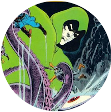
A wise man once told me that, "Life is the name of the game."
His name was Bruce Forsyth and he told me through my television.
But life is also a magical thing, filled with strange coincidences that test the resistance of even the hardest of sceptics.
Only last week I was going to review Marvel Spotlight #13, featuring the Son of Satan. Oh how I thrilled at the thought of raving about Happy Herb Trimpe's artwork and Daimon Hellstrom's descent into Hell to sort out his dad.
As it turned out, there was only one problem with this plan.
I'd already reviewed it.
I'd reviewed it here, way back in August 2010.
How many things have changed in the two years since then. But the one thing that hasn't changed is the one thing I didn't mention in that review.
And that's that the masthead to Marvel Spotlight #13 is almost certainly my favourite comic book masthead of all time. Not only does it feature lettering that practically curls its way out of the cover at you but, on this occasion, and this occasion alone, it shines like Lucifer himself.
My initial plans thwarted, instead of reviewing that issue, I chose to review Monsters Unleashed #11, featuring the not totally dissimilar Gabriel the exorcist. But, in one of those twists of fate that prove there're dark powers at work, in the comments section, Comicsfan said he loved the masthead of that mag and that I should ask you about your favourite comic book masthead.
And, by Captain Kremmen's well-honed beard, that's exactly what I'm doing. You know where the comments button is. Feel free to use it.
Monday, 8 October 2012
Subscribe to:
Post Comments (Atom)


9 comments:
Good question!
The broadsword version of Conan the Barbarian and the Neal Adams X-Men for Marvel.
For DC, the elegant swirl of Adventure Comics and (maybe an odd one) DC Special from the late Sixties. It's very Pop Art.
Hey, smile when you call me a "dark power at work," bub! :) I don't know why that description delights me, but it does, for some reason. Though I'd better leave it off of my resume.
I'm so indecisive on this, because I can't boil down my favorite mastheads to just one. I like Tomb of Dracula, even if it's a little obvious. One of my absolute faves is the masthead we got when Dr. Strange took on his masked identity--I LOVED that look on his mag. And that red-white-and-blue, flag-waving appearance of the Captain America title just looked great on the racks.
Excellent masthead. One I really liked from that time was 'The Beast' logo on Amazing Adventures. Possibly designed by Jon Costanza?
Definitely one of the best, especially coupled with that particular image by Romita - although there's a bit too much clutter around about it for my liking.
For me, the Jim Aparo covers for The Spectre in Adventure Comics (that you've written about previously) were especially successful - strong and bold design, the image and masthead nicely integrated through the use of colour and overlapping figures.
Son of Satan (and that particular cover) has always been a favourite of mine as well - others I like are
DC:
House of Mystery (my favourite logo) Spectre (the original first few issues logo)
Green Lantern & Green Arrow:
MARVEL:
Monsters on the Prowl
Creatures on the Loose
Captain Marvel -
Although you can beat the classic Superman really - McScotty
I'll go with Iron Man. The rivets conveyed what that hero was all about.
Oh, and Honorary mention to Superman. That logo with the 3D lettering trailing off into the distance was what a Superhero masthead should be. And it's been so since issue 1!
I also liked the logos of Marvel's b&w comics of the period: Monsters Unleashed, Tales of the Zombie, Haunt of Horror etc.
I've got to be honest - that logo is not the best example of its kind. It's a bit rough in places and really needs brought up to an acceptable standard. Trust me, I'm a doctor/expert/handsome Scottish laddie. (Delete as applicable.)
All I know is it's shiny and I like shiny things. If they'd invented a hero called Shiny-Man, I'd have bought every issue.
Post a Comment